
Before Mise en Mode, I went on a journey to try to truly understand what it meant to have a design token be “semantic”. The community had a fairly good understanding about what this meant as color, and the benefits that comes from thinking in this way. Text has been perhaps more elusive. Though in recent years we are seeing more and more teams separating the meaning of an “h2” from its visual presentation. Separating the reason why something exists from its style is what semantics is all about.
What was first a blog post here turned into six months of research now titled Complementary Space which aimed to rethink space in the same way. What does it mean to apply space somewhere, how would we name those tokens, and most importantly how to convey the concepts of being comfortable or cozy through these tokens.
This post is meant to revisit the article that I wrote those years ago, share some insights I’ve landed on, and finally to be a memorial as I expect to eventually take the original web page down to reduce cost for all of these domains I have. 😅
Gestalt proximity
The first concept to grasp is the purpose of space which is covered by the Gestalt principle of proximity
The principle of proximity states that items close together are likely to be perceived as part of the same group — sharing similar functionality or traits.
In short, when we apply space somewhere, what we’re doing is conveying a relationship between objects. When there’s more space between items, they are less related than items that are more closely related.
This means that the value that we assign to spacing properties is describing a relationship. There’s two kinds of relationships that we see, parent-child and sibling relations. Parent-child relationships tend to have a larger amount of space, or in terms of relationships, are slightly more distant than siblings. This is a common visual paradigm, where the padding around the card holding the children inside is larger than the gaps between those children (ie., siblings).
Periscope
Historically, we’d use something like a T-shirt scale to say how much space are between the objects. However, as I’ve said before, scales aren’t semantic. It isn’t clear where any of these tokens are meant to go in the experience. It’s subjective.
What I landed on after much development is to have the scope describe the density of a region, not the tokens. To get a better understanding of the idea, let’s watch a moment from the TV show MacGyver. Specifically this clip from episode called “Hell Week”.
In the clip, the male student is competing in a contest which is meant to keep other students from entering their dorm. Each student devises a way to keep the door from opening but all have some solution that allows entry. This student’s idea was to make a miniture version of the room. Everything is copied in detail so that when you look through the door’s eyehole, you see the miniture but it looks like a normal size room.
The point of this example is that trying to determine the space between objects without knowing the frame of reference makes it so those distances are visually equal. Certainly, if we are inside of the room we can see, and more importantly measure, the distance between the bed and desk. When we do this, we can immediately tell that the distance between these items in the life-sized room is much larger than the model. But through the eye-hole you can’t because the frame or reference is gone. Everything is proportional. This is how scale models work. You measure the life-size objects, and then apply some ratio to scale them up or down. Through different lenses these can appear the same but in the larger environment actually be different sizes.
Another way of thinking about this is the distance between you and your front door in comparison to the distance between you and the nearest ocean. The nearest ocean is probably very “far” for most people in comparison to their front door. Now, think about the distance between you and the nearest ocean, and the distance between you and the moon. Suddenly the distance between you and the ocean isn’t far at all. Changing the frame of reference is changing what it means to be far.
The point here is that we can change what it means to be “far” by changing the scope. And because our goal is to semantically define what it means to be far, all we need to do is have different “scopes” that express different kinds of far. More importantly, when I say “far”, I really mean space.
In the following image, I’ve made a component that could either represent the entire page or a card within the page.
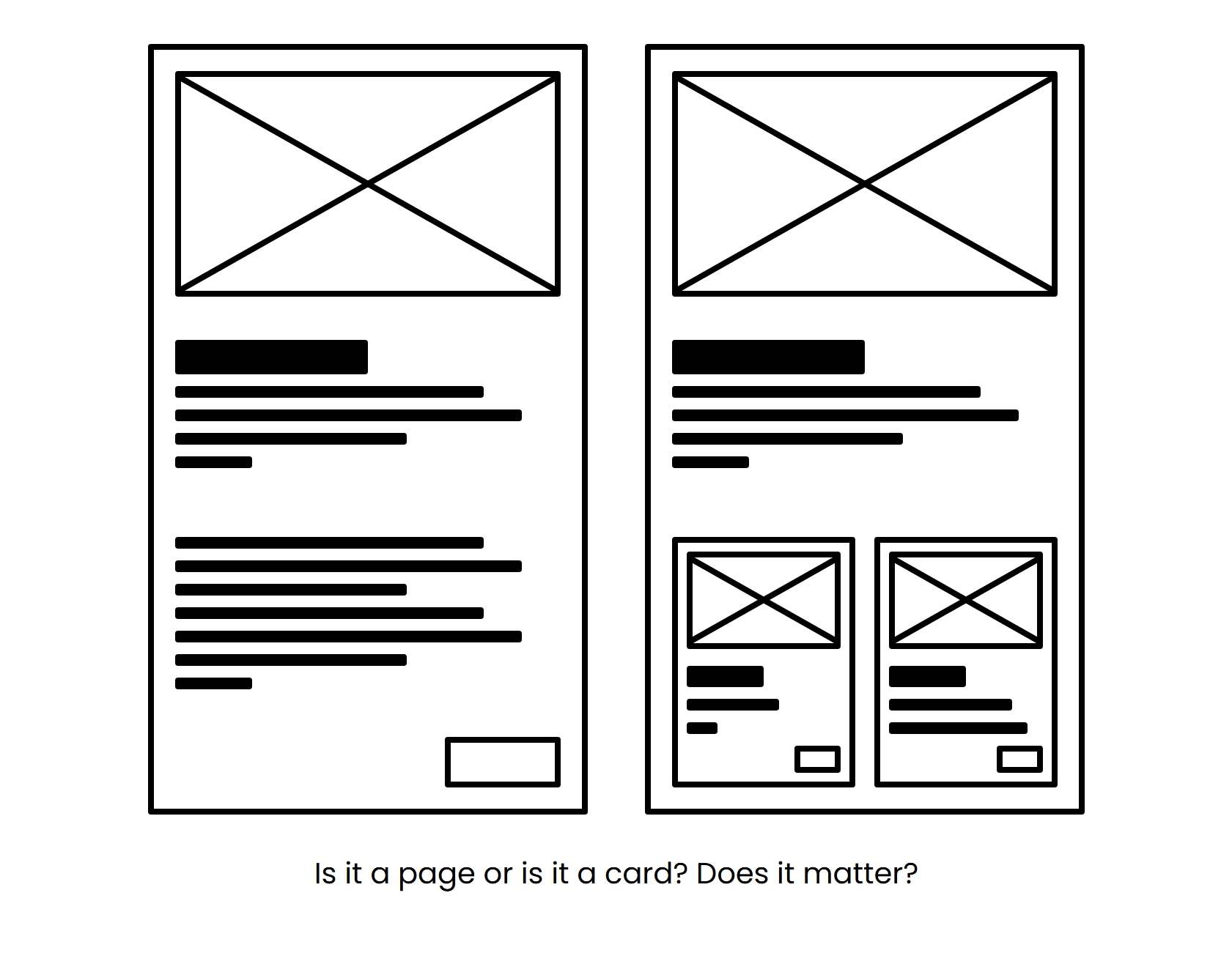
I use the same base composition for both of these things. On the right, the smaller components found within the larger one are really just scaled down versions of the larger one. Certainly, we see things like typography scaled down, but we also see the space scaled down too.
In this way, we don’t see the page as a whole. Instead we zoom into individual scopes of the composition and then decide how dense that region should be. Generally the deeper we go, the more dense the composition is expected to be.
What are the tokens?
In all of this research, it was important to me that I could land at a similar outcome to what Nathan Curtis had written about in his work on spacing tokens back many years prior but to have this new way of understanding space. Here’s his approach from the article and the complementary approach side-by-side.
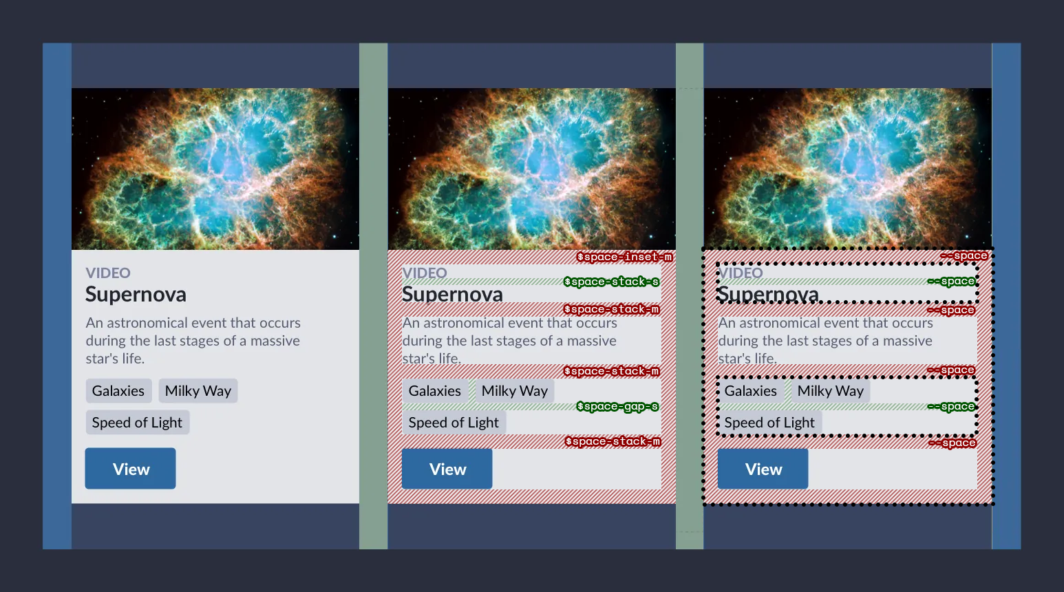
In Nathan’s approach, you’ll see that each space token describes composition of the space and its amount. Inset means it goes around content, stack means it goes between elements on adjacent sides, and gap means it goes between on all sides. In this way, there’s lots of decisions that must happen at each location where space is going to exist that also depend on the composition of the elements.
In Complementary Space you’ll see that there is a single token placed for every location we expect to represent some amount of space. This immediately reduces decision making because there is only one token to choose. This means that the only decision that a person needs to make is the “scope” of the content. In other words, am I expecting to reduce the context down to a lower level of hierarchy than the parent above. Where these scopes occur are represented by the dotted borders surrounding regions of the card in the example.
What else do I need?
Below is a interactive demo of the approach, showing how we can make a region more dense by adding the data-density-shift attribute. See how there are several different amounts of space being applied while using very few differently named tokens, in this case --space-near and --space-away from the original implementation.
Again, this isn’t entirely needed as demostrated from the image just before but representing padding and gap as describing relationships seems to describe the purpose more than a single space token.
Either with one token or two, this works by compounding identical selectors. Assuming that the way something becomes more dense is by being identified with data-density-shift, this is how you’d create the levels:
[data-density-shift] {...}
[data-density-shift] [data-density-shift] {...}
[data-density-shift] [data-density-shift] [data-density-shift] {...}
As you can see, we duplicate the data-density-shift attribute selector which shows how deep the region is related to other density shifts. While you could have more control by explicitly giving each shift a number related to depth, this brings a subjective decision in an otherwise binary decision of “should this be more dense that the region above?” This also brings more care to the hierarchy of the page. Things that are less dense are more spread out and unrelated sections of content are clearer than if they were composed without these considerations.
Within each level, we expect the spacing values to decrease, making compositions appear more dense. In the CodePen, I create a few Sass functions to help generate the scale based on the number of levels. In the code below I’ve updated to use padding and gap instead of the earlier near and away.
$attr-sel: "[data-density-shift]";
$levels: 4; /* including body */

/* Fibonacci Sequence */
@function fib($n) {
  @return if($n <= 1, 1, fib($n - 1) + fib($n - 2));
}

@mixin vars($n) {
  --padding: calc(
    #{fib($n + 1)} * var(--density, 8px)
  );

  --gap: calc(
    #{fib($n)} * var(--density, 8px)
  );
}


@for $i from 1 through $levels {
  $nest-sel: if($i == 1, "body", selector-nest($nest-sel, $attr-sel));

  #{$nest-sel} {
    @include vars($levels - $i);
  }
}
You might also notice that I’ve replaced the usage of rem with px in the code above. This is a separate topic but in short, if the user increases the font size, this is meant to help with readability and the user isn’t meaning to “read” space. Therefore, using units unrelated to typography are preferred.
Speaking of values, this is an area where you might want to explore even further. For example, on touch devices, you might consider having more space than on devices where a pointer is used. This is to increase the target area of interactive elements and make them slightly easier to interact with than using a finer pointing device. Importantly, this is not the difference between “mobile” and “desktop” as some might have you believe. The reason why we should be making space larger is for interactive targetting, not because something is considered mobile. Since this something that should affect the experience globally, this is a matter of updating the density under a media query.
@media (any-pointer: coarse) {
    :root {
        --density: /* something a bit larger */
    }
}
I recommend reading this post at CSS-Tricks about interaction media queries for further considerations.
Avoiding size variants
A large benefit of the scope-based approach is that size variants for your system are no longer meticiously defined. The size of an element is determined by the context it is placed within. In other words, if the button is meant to be smaller, place the button in a region meant to convey a higher density.
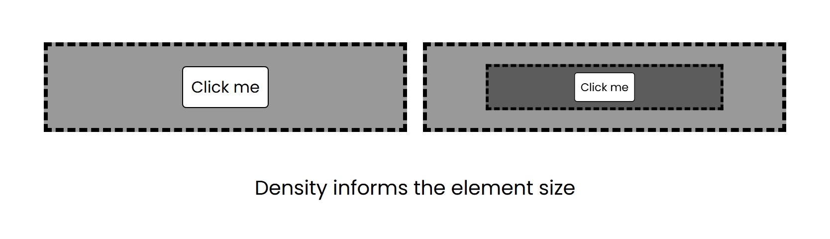
This is assuming that other cosmetic properties of the button are also determined by the density, such as font-size.
An example at my design system illustrates this in code in the following way where denser causes the scope to increase in density (ie., space becomes smaller) and can be added to any element:
<box.div denser gap>
  <Button priority="primary"/>
  <box.div denser gap>
    <Button priority="primary"/>
  </box.div>
</box.div>
Because the size of the gap is wholly determined by the surrounding scope, gap becomes a flag that merely indicates if space should exist between the children at all.
While this does create the ability to have more levels of space than you should ever use, I recommend having 3 to start. The highest level designed to support marketing pages, the next level designed to support general productivity dashboards, and the last level to help with the composition of cards and other focused regions. This assumes that you are representing padding and gap as tokens. If not, you might require more levels to accurately describe different kinds of space from scope alone.
When will you be ready?
The reality is that we are still teaching teams semantic color, let alone semantic space. People continue to hard code values into places where they just can’t be bothered to do the right thing. Until we change the mindset of the industry, we’ll be stuck doing things the old-fashioned way, wondering why it’s so hard to make new expressions of our experiences.
So, instead of trying to implement in your company’s design system. I recommend trying to implement into your own personal projects. That way, the understanding of how everything works doesn’t need to go beyond you. Give it a shot, and let me know how it goes? Let’s make space complementary. 🤝