

There’s no shortage of posts that explain how to perform responsive typography. Here’s a small sample of them:
- Addressing Accessibility Concerns With Using Fluid Type
- Fluid Typography: Predicting A Problem With Your User’s Zoom-In
- Modern Fluid Typography Using CSS Clamp
- Fluid Responsive Typography With CSS Poly Fluid Sizing
- Responsive And Fluid Typography With vh And vw Units
And that’s just articles from a single website!
However, in those articles no one really mentions what qualities you are meant to look out for when figuring out the values. I’ll admit the closest article to this is the first article which explains that if you use only viewport units for a font-size that it’ll break the zoom expectations in the browser, which will cause a WCAG 1.4.4 failure. The recommendation there is to always include a non-viewport unit in the calculation with your viewport unit.
Well, I’m about to turn that on its head. 🙃
What I set out to do is to have a rule that helps explain what the transition should be for heading font sizes between large and small screen sizes. In other words, what the middle value of a CSS clamp() function is expected to be.
Min and Max
First, we need a few numbers to start. The first two are up to you, your font family, and typescale. These will be the minimum size and the maximum size your heading is meant to be. For the purposes of example and to exaggerate the effect, let’s consider this in terms of marketing display text. Really big and fun text on desktop but somehow needs to be reasonable on a small device. In this example, I’m just going to make variables for these and they’ll be in the places where you’d expect in the clamp() function:
.text-heading {
    font-size: clamp(
        var(--heading-smallest),
        /* heading change */,
        var(--heading-largest)
    );
}
The middle value is what we’re going to calculate, and we’re going to do that with a few more numbers. A minimum viewport size and a “maximum” viewport size.
The minimum size that I’ll recommend is 320px. This comes from the WCAG 1.4.10 about reflow.
Vertical scrolling content at a width equivalent to 320 CSS pixels
The “maximum” is not really the maximum viewport size. It’s closer to being a breakpoint of sorts. What this size is meant to be is the point in which the largest size that the heading is meant to be starts shrinking to the smaller size. It’ll stop shrinking at 320px. What we’re going to explore is what that size is meant to be.
My thinking for this starts with the recommendation of number of characters for body copy, which is somewhere between 40 and 80 characters depending on your source. I typically pick a number in the middle, 60 characters, to represent the optimal reading length. Importantly, this is speaking about paragraphs. This is not meant to be the same number for headings, and in my research I couldn’t find a number that represents what the optimal character length for headings is meant to be. If there is one, please let me know.
To make up for this, I figured that we typically want to lockup paragraphs with the heading. We want them to visually match together. If we’re still speaking in terms of characters and the body copy can be represented as 60rch (assuming that the root font size dictates body copy), then we could also set the heading maximum length in terms of those characters. So that means that the “maximum” viewport width should be 60rch for headings.
It’s also possible that this feels too large for you. If you disagree and feel that the length of the heading is meant to be shorter than the related copy, then feel free to update this value. But the expectation is that this a maximum length that causes the wrapping behavior of the heading to achieve LooksGood™ status.
Time for the math
Ok, these will be all of the values we need to determine the middle number. Here’s the formula:
If that looks familiar, it’s because you may have read my other typographic posts that discuss a rate of change. This is trying to determine the slope of a line. Let’s write this in terms of CSS:
.text-heading {
    --m: calc(
        (var(--heading-largest) - var(--heading-smallest))
        / (60rch - 320px)
    );
}
Except this wont work this way in CSS. We’re not able to divide with a unit number, which would be the result of 60rch - 320px. While you could do some fun hacks to make this work, I’m going to suggest something different: to make everything in terms of rem.
The --heading-largest and --heading-smallest are probably in terms of rem already or something relative to font-size like rem. So if we update the numbers below to also be rem, then we don’t need the units in the denominator. In my experience, this seems to be the following:
.text-heading {
    --m: calc(
        (var(--heading-largest) - var(--heading-smallest))
        / (30 - 20) /* 30rem - 20rem */
    );
}
Now what we need to do is relate this to how the viewport changes. I specifically recommend viewport over container because having different sized headings depending on the container instead of the context of the content could be hierarchically confusing. Having all of the same heading behave identically maintains the hierarchical relationship across all areas uniformly.
Scaling text
The last part is borrowed from this post on CSS-Tricks, which also explores responsive typography but has a special distinction: when you resize the examples, the text looks like it scales as if you wired scale() to the viewport for the text. I found this to be the missing part to fluid headings.
My goal was to keep the wrapping composition between the “maximum” and minimum. While Pedro’s post uses JavaScript to do the heavy lifting (because the dividing problems we mentioned earlier), we can get there in CSS. In fact, our implementation is arguably easier than his because we want this change to be linear. In other words, as the viewport changes, the rate of change is a straight line between the max and min. What this does is maintain the wrapping composition of the heading between the max and min. This is that scaling effect from the post.
Here’s how we’d finish this:
.text-heading {
    --m: calc(
        (var(--heading-largest) - var(--heading-smallest))
        / (30 - 20) /* 30rem - 20rem */
    );
    font-size: clamp(
        var(--heading-smallest),
        var(--m) * 100vw,
        var(--heading-largest)
    );
}
Remember, the recommendation is for viewport units in the font-size to be accompanied by some non-viewport units, which is what the --m is providing. --heading-largest and --heading-smallest are font sizes you’ve set for headings.
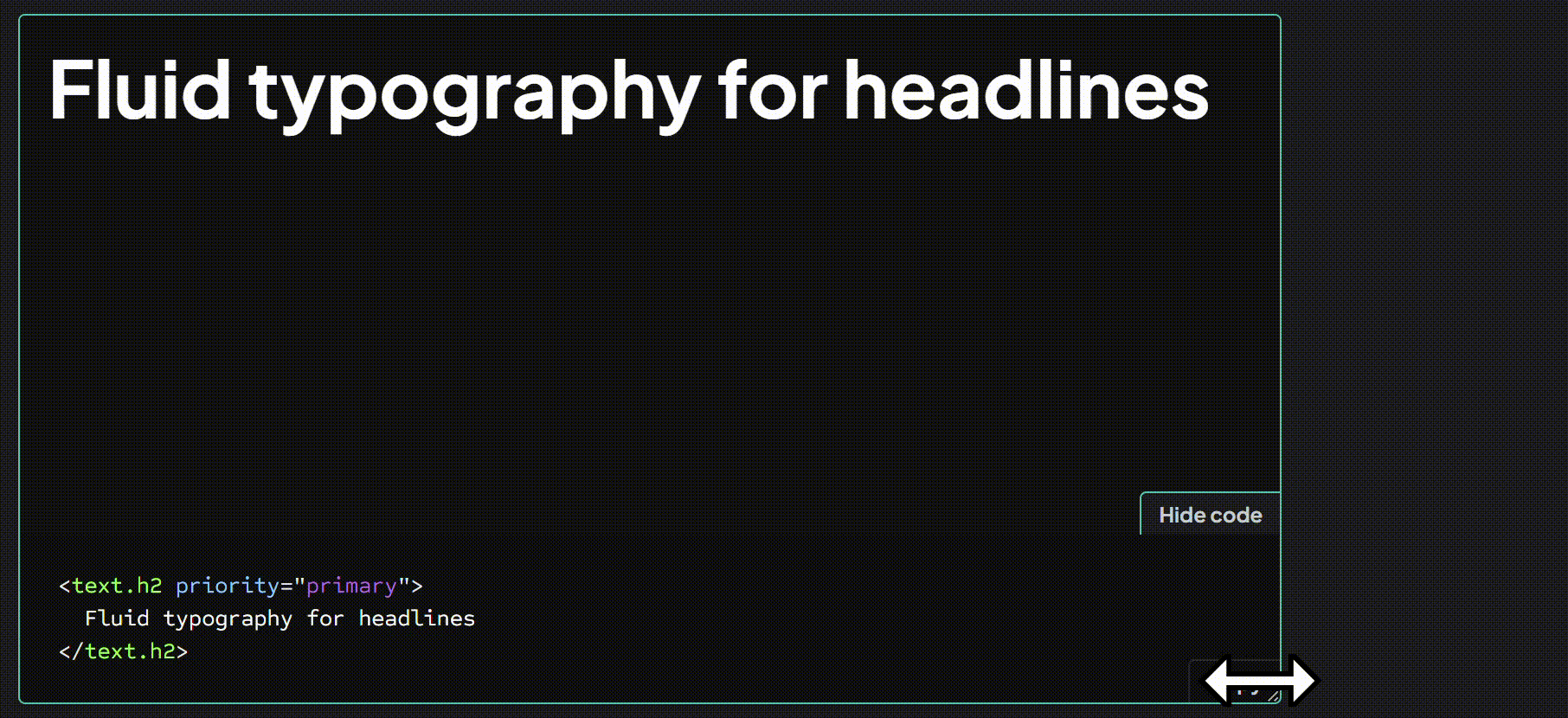
You can check a working example out on my design system playground or if you just want to watch the magic, I have a animated GIF below:
Hopefully, this takes less of the guess work into the numbers that are meant to appear in the clamp() and maintains typographic lockups more regularly.