
Off the heels of my talk at Clarity this year I omitted a few concepts that could have been included but may have detracted from the focus of the talk. One of these was the qualities that make a token truly semantic. I’ve had many arguments in the community regarding tokens that are or are not semantic. So the purpose of this article is to be clear about which tokens are best used directly in the experience from other tokens that can be used for organizational purposes.
Semantic tokens do not suggest values
This is an image from the Mise en Mode talk, which begins to introduce why space is not semantic in most systems.
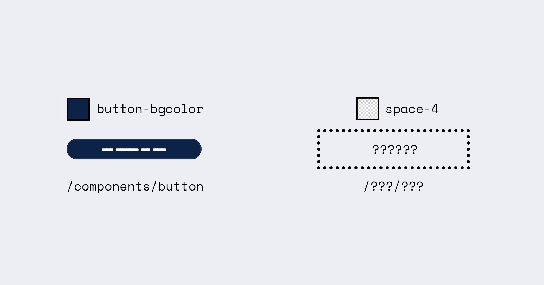
The semantic token button-bgcolor does not give any indication of the color that is meant for this token. While a token color-blue-500 suggests that the color meant for this token is a blue, perhaps in the middle of other blues within a scale. This is an important distinction because we want the ability for these tokens to change based on outside factors; a common example being light mode and dark mode. However, we are not just limited to these user preferences. The color can change based on branding, localization, or expressiveness. It would be inappropriate to change the value of color-blue-500 to an orange, which is why we instead use and change button-bgcolor because it does not suggest the value.
I suggest that we ultimately do not need tokens that aren’t semantic functionally in our ecosystems. However, the reason why a token like color-blue-500 exists seems to be for human discourse. It is easier for people to speak about a color in a human-readable way than a color code. It also restricts the number of possible colors to use so slight variations of the same value do not appear accidentally.
Semantic tokens are generic component tokens
This was one of the images that didn’t make it into the Mise en Mode talk:
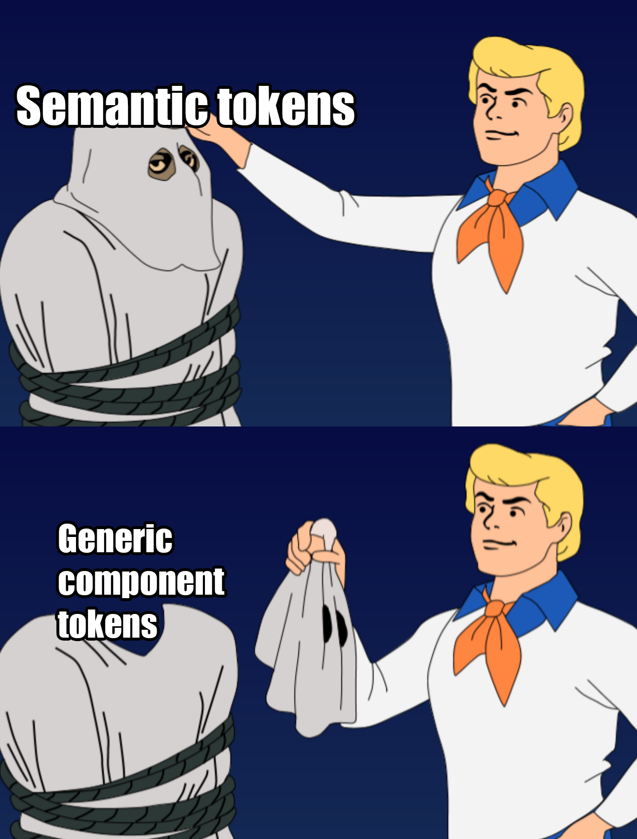
When you are in the process of identifying what semantic tokens to include, you should aim to keep the number of tokens low. This helps with token management but also ensures that ideas are consistent across the experience. As an example, I believe that items that you can click should be given similar treatments so a user learns these are the clickable areas. If we were to provide different treatments to these components, the user may miss options because the treatment is unique.
In this way, I like to create categories of components. For example, all components where we expect a user to provide input to the system could be called “control” components which would suggest a family of tokens that are meant to style controls similarly. From here, we would get semantic tokens such as control-borderColor which might describe the <input/> border.
While you could become more specific, this tends to cause treatments to be more unique. As an example, would you expect textInput-borderColor to be different from checkbox-borderColor? Probably not. So the exercise of identifying similar atomic components is important to determining your semantic token set. These similar components are grouped into generic categories (eg., non-interactive surfaces, actions, controls, etc.) which form the foundation for your tokens.
A good exercise to determine what your semantic tokens could be is by reviewing low-fidelity wireframes of your experience. Because these are meant to describe the pure functionality of the experience, without any additional noise of possible expressions, we can identify the most critical parts of the experience. Then we put those elements into categories based on their purpose in the experience. That purpose is the intention; the semantic meaning for why they exist here.
Semantic tokens are not dependent on each other
This is the “smedium” problem. A semantic token can be added or removed from the ecosystem without having to rethink other tokens within the same category. On the other hand, if you have a token called space-sm and another called space-md, you’ll be unable to introduce another token between them without introducing something unexpected and not systematic. So a good rule of thumb is that semantic tokens do not include a scale. The scale suggests that there are other tokens above and below that could require tokens to be inserted between these over time.
A caveat is the ordinal system (primary, secondary, etc) which is meant to suggest priority and hierarchy within the experience, which should not change between token values. As an example, the primary button is the action that we expect the user should take in relation to all other actions on the page. This is regardless of the treatment provided to the button. The primary action should also be apparent in low-fidelity wireframes. Because of this, a specialized purpose of hierarchy within the experience regardless of expression, the token buttonPrimary-bgcolor is appropriate. In contrast, the token space-md cannot be given a purpose in the same way. We cannot accurately determine what a space-md would be in a low-fidelity wireframe nor does it truly matter to the end-user to achieve their goals.
What can be semantic?
Color and typography can be described as semantic tokens. Space can also be semantic if you reprogram the way you think about space. What semantic tokens have in common is that they have a simple, yet consistent, construction:
[purpose]-[priority]-[property]
Priority is optional and introduced if the content described must have an order of importance for the user. Describing space in importance is not necessary. Also, I am omitting interactive alternatives like hover and chosen for simplicity but they may also be included in the construction.
This would suggest that elevation can also be semantic as we use this to describe importance; elements closer to the user should be perceived as more important. So we’d expect tokens such as surface-primary-shadow. Notice that we aren’t introducing surface-highest-shadow as we aren’t attempting to suggest how it looks but again the purpose. modal-shadow could also be appropriately semantic; only a more specific semantic token better known as a component token.
Using the ordinal system helps out in other ways. It ensures that an element is not introduced that attempts to represent “more-than-primary” (something many marketers would love to try). It also suggests that priorities lower than tertiary are cumbersome and therefore avoided. I’d also include that having more than 3 levels is useless for user interpretation within the experience in the same way we often omit heading levels less than h3 from most experiences.
Expanding outside of tokens
In the exploration of Mise en Mode, I also considered suggesting a naming convention for modes. However, I quickly realized that this too required additional context. I mentioned at the end of Ondark Virus that we should consider semantic naming at the scope level. This suggests that the words “light” and “dark” are also inappropriate and considers a possibility where the curation of values is for a semantic purpose. In other words, why do we need this new collection of values? What are we trying to express?
The result of this question should be a research study to uncover why people are asking for “dark mode” because perhaps they are really asking for improved battery performance when browsing or perhaps more contrast for readability. In this way, we encode the purpose for the new collection of values as a semantically named mode which allows the purpose to be understood.
Importantly, I do not suggest that the words “light” and “dark” be reimagined for user preference. I do not believe that users truly understand why they select light or dark without introspective questions or explicit instruction; it often becomes a matter of unconscious preference. However, I believe it is our responsibility in design to understand our users’ needs better than they do so that we provide solutions they didn’t fully realize. In this way, I would recommend renaming “dark mode” internally to align with its semantic purpose, while continuing to expose “dark mode” as a user preference externally. From here, determine why the user selects a mode and provide the appropriate values to reflect this choice based on understood user needs. I will admit, that some users will simply suggest that a mode looks better, but this might be an indication of stylistic preference and suggest they would rather have the ability to customize their experience.
#naming-is-hard because understanding why is hard.