

The “ondark” virus is infecting token names in the design systems community everywhere. I’ve tried providing recommendations in token related posts and replies before. However, it seems this approach is becoming more wide-spread so I want to give it one final try to describe the problem with this naming scheme and provide some help with prevention.
This isn’t about what a token name should include, it’s about what it shouldn’t.
Prognosis
Imagine you have a UI which is primarily light colored. Perhaps a white background with nearly black text. There’s a section in this UI that you want to have a stark contrast with the rest of the page. In this section, you have some text lockup and a call-to-action button. The button has all the same properties that other buttons in the system have, except it’s located on this dark background.
Most folks might have a button prepared specifically for this scenario. We might even provide a configuration for when this happens in code. Under the hood, that might reference different tokens which point to specific ondark values sent to the page.
This works fine for this section which covers just the background, text, and button.
Soon after, a request comes in to show a comparison table in this area; showcasing the benefits of the product of feature. In the current system, you’d need tokens to describe all of the borders of the table. Maybe you have something generic that targets borders in this area. But unfortunately, you might see a problem begin to appear.
The problem is that for every UI element that might appear in this section in the future, you’d need to define an entirely new set of tokens to describe the color for that UI. This is especially exhausting since you’ve already defined tokens semantically for all of these things in the “default” environment. To fully cover the dark area, you’d need to double the amount of token names to include the additional “ondark” (or “inverse”, “reverse”, “contrast”) infix.
No bueno.
Remedy
Semantic tokens
The first step is fully investing in semantic tokens. I’ve called them “intents” in the past to further enforce the expectation that the name describes purpose over value. We’re talking about token names like --button-background or --input-focused-critical-border-color which give information about the component or pattern and the property being influenced. In no way does it give any information about what the value of this color is. The more you avoid encoding the value in the name, the more flexible your system will be with the opportunity for that color to change in the future.
This extends to any token; describe the purpose and avoid the value when naming.
Scoped themes
A theme is the collection of values assigned to semantic tokens. The semantic tokens are a contract that should have permanence and meet expectations of folks building UI over time. These are the tokens that appear on the left-side of a theme. The values that would appear on the right-side can and should have a separate stakeholder, most likely one that represents a brand. I recommend avoiding managing both sides if possible to not introduce subjective bias or confusion in token naming.
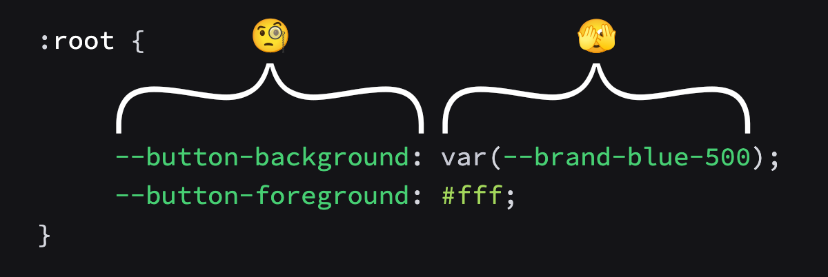
I cannot stress enough, how values are assigned on the right-side does not matter. Values can be referenced, hard-coded, computed, or otherwise because they should never be used directly within the UI. A color palette is influenced by the brand and determines what --brand-blue-500 means. Here, the brand is responsible for curating the right-side values and how they are finally assigned to the left-side.
The design system team is responsible for maintaining consistency on the left-side; that’s it. They should only focus on the semantic token names for those values to be assigned and how they might support describing the experience at scale.
Now for the key insight — instead of the dark area and the light colored page needing to be informed by a single theme, think of the dark area as an entirely separate theme. In this way, the values that represent --button-background can change depending on scope.
- No additional configuration at the component level. You don’t need to remember or even know that this button is on a “dark” surface.
- No additional token names. Self explanatory, naming is hard and scaling those names is even harder.
Now the only name you need is the one describing the theme; “dark”.
Prescription
This still requires the design token values to be curated to account for a dark UI. If you worried about defining an entire new theme worth of tokens, start small. Only define the ones you need at first; maybe background, text and button. At some point you might have the resources to define it all and then you’ll have an entire new theme to try.
I’ve considered going farther, specifically with surfaces that expect to demonstrate feedback (eg., warning banner). You might imagine this banner similar to the dark section above with a text lockup and action to take. I say if you have the resources to prepare this as a theme, go for it! You’ll be better prepared for when code samples might appear within the notification. Otherwise, you’ll need to be highly restrictive to the kinds of content that appear within various colored surfaces. And we all know how much designers love restrictions. 😉
It’s possible to over compensate. As an example I wouldn’t recommend creating a separate theme for inline feedback elements. Badges, notification dots, and error text can and should also be handled semantically inside a normal theme. Just think of a newsletter signup in a dark section; it should have an error message if the input isn’t valid. If you think in surfaces, like a sub-artboard, then you’ll better identify when a scoped theme would help.
This new recommendation also requires that the system delivering themes be flexible enough to request more than one. I think there’s an opportunity for some optimization here as well; where we statically analyze the page for tokens used within scopes and only serve what’s needed. However, to start you could just import the theme when a scope is added. The benefit of this is if the scoped theme hasn’t been included or the scope hasn’t been applied, it’ll fallback to the base theme values instead.
<body>
    <button>This button has a black background</button>
    <section data-theme="dark">
        <!-- Missing definition for the dark theme,
        everything here inherits from the light theme -->
        <button>This button has a black background</button>
    </section>
</body>
Recovery
If you’re already using the “ondark” naming convention, it’ll be hard to move to this new system. That goes for any semantic token that was expected for public use. Deprecating tokens at the semantic tier is very difficult because they could be used anywhere across the platform.
Luckily there’s a path forward:
- First, you can setup the scopes and apply within the UI in the appropriate locations, making note of the UI elements that exist in those locations.
- Then define the values for those themes, perhaps reading from the “ondark” values.
- Start serving those themes to the pages, which will be inert at first because no UI elements should reference the tokens.
- Finally, either remove the component configuration that applies the dark theme or remove the “ondark” token assignments for the more generic tokens.
- You can now safely remove the “ondark” token virus from your system.
I wish you best of luck in your path toward recovery.
EDIT (2023-01-12): Dave posted a great question as a follow-up and it deserves addressing.
— Dave DeSandroI’m curious how you would accommodate session-level Dark Mode? Does the hero theme stay dark, or maybe sub-themes like
data-theme='inverted'
My reply was half-joking but in seriousness, the answer is to continue leaning into semantic naming at the scope level. For the purposes of this demonstration, it was more helpful to use the word “dark” to further cement what was happening within the scope. In practice, the scope should be described with some meaning or purpose for the change in scope over expected appearance. For the examples above, the “light” theme could instead be the “base” theme as it is meant to be the default. The “dark” theme could be “feature” theme as it is meant to highlight features (in our examples).
<body data-theme="base">
    <button>Login</button>
    <section data-theme="feature">
        <button>Click here</button>
    </section>
</body>
This way user preferences could be read to determine what values are applied to which scope.
/* no-preference */
[data-theme="base"] {
  /* light colored assignments */
}

[data-theme="feature"] {
  /* dark colored assignments */
}


@media (prefers-color-scheme: light) {
  [data-theme="base"] {
    /* light colored assignments */
  }

  [data-theme="feature"] {
    /* slight contrast to light assignments as needed */
  }
}

@media (prefers-color-scheme: dark) {
  [data-theme="base"] {
    /* dark colored assignments */
  }

  [data-theme="feature"] {
    /* slight contrast to dark assignments as needed */
  }
}
If you want to be more efficient, only serve the user-preference when it is set.
<!-- first stylesheet is no-preference -->
<link href="default.css" rel="stylesheet" />
<link href="light.css" rel="stylesheet" media="(prefers-color-scheme: light)" />
<link href="dark.css" rel="stylesheet" media="(prefers-color-scheme: dark)" />
As you can see, things get complicated when you are including user preference alongside the scoped themes but “ondark” is definitely not solving this. For scoped themes, it’s complex but not impossible. During the first pass, I recommend leaving user preference out to keep the execution simple but plan for it in a future implementation.
If it was only as easy as body { filter: invert(1); }!