
You’ve seen it before, an ‘x’ at the corner of a surface which will allow the user to exit that surface. In design, it seems simple to just place the button at the top corner. To engineer this, we have a few options:
Absolute Position
The first option most folks might consider is something like the following:
.surface {
  position: relative;
}

.surface button.close {
  position: absolute;
  /* https://developer.mozilla.org/en-US/docs/Web/CSS/CSS_Logical_Properties */
  inset-block-start: 0; /* logical property for "top" */
  inset-inline-end: 0; /* logical property for "right" */
}
Many design system component libraries use this approach:
- Ant Design System
- Base Web (Uber)
- Carbon Design System (IBM)
- Chakra UI
- Github Primer
- Reach UI
- Stacks (StackOverflow)
The problem with this approach is the way that position: absolute works. When applying position: absolute; to an element, it takes that element out of the normal flow of the document. This means that other elements cannot interact with this element.
In some configurations for the above components, the content (usually the title) could appear visually layered below the close button.
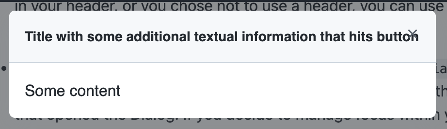
Some implementations solve this for by providing enough padding to the content area so the button never collides. However, this often results in an imbalance of padding and may not be desirable from design.
Flex header
Another method is to add the button as a flex child to a header of the surface.
.surface .header {
  display: flex;
}

.surface .header button.close {
  margin-inline-start: auto;
}
Here’s a list of components across design systems using this approach:
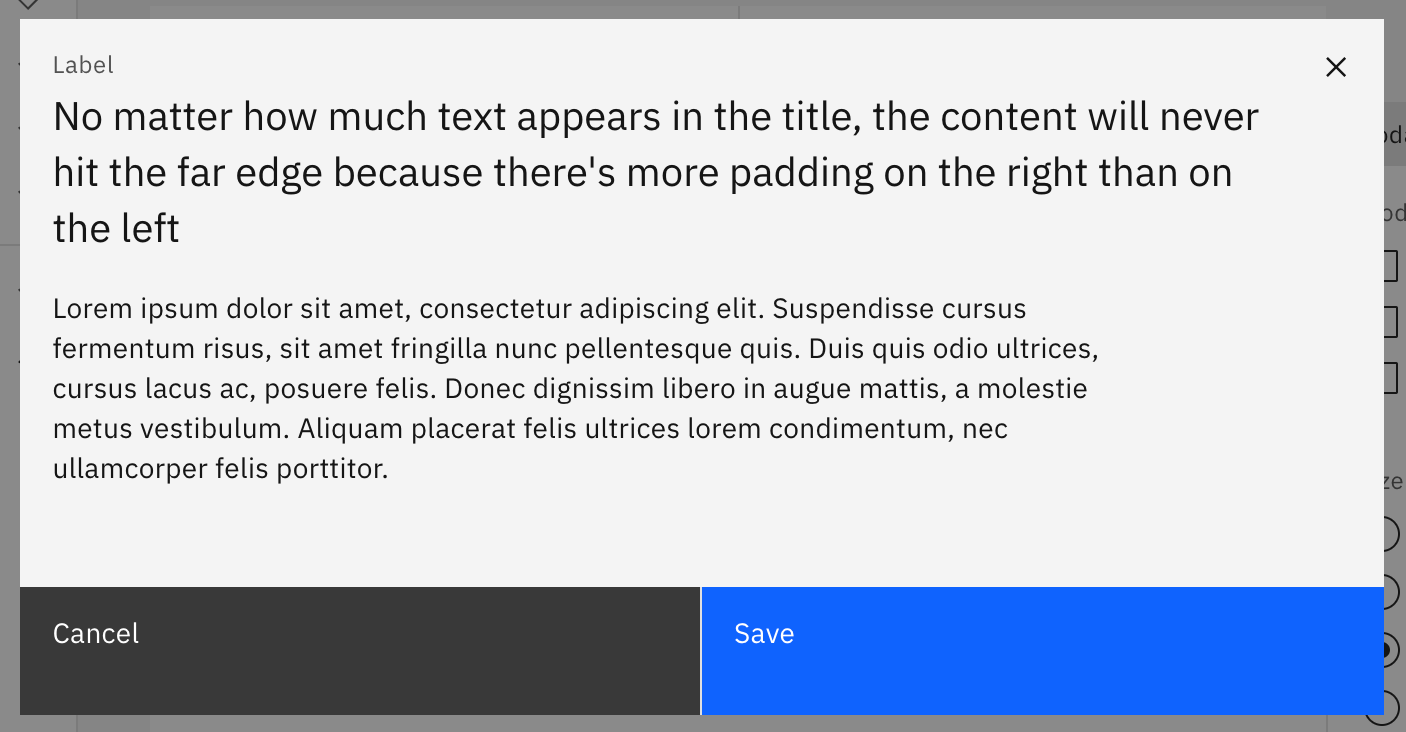
While this avoids a collision between the button and content, it also requires that the header exist which will be at least the height of the close button. In cases where additional header content doesn’t exist this displays a large forehead before the content.
So if the surface doesn’t have a title, the amount of space might not be desirable by design. Certainly, if design is attempting to curate the title, this might have some control. However, incorrect alignment could also result in the close button centering within the header instead of pinning to the corner.
Unique alternatives
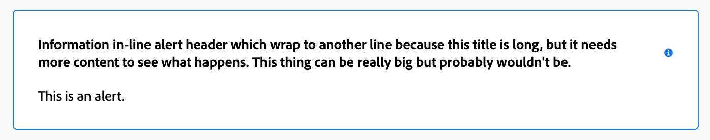
There are some other approaches. Salesforce Lightning includes the button outside the modal which might not work for other surfaces. Their alert component uses the position: absolute; technique as an example which will have similar problems as described above. Adobe Spectrum avoids the ‘x’ button entirely and provides an explicit action to close the surface. However, their alert component suffers from problems using the icon accessory in relation to the title in this similar layout.
The “buoyant” approach
Let’s be clear about some requirements. If design is expecting a close button to appear at the top corner:
- Padding around the surface should be visually consistent.
- The close button should never move from the corner.
- The content in the surface should not collide with the close button.
We can leverage two features of CSS to get an intended result.
Recent relative ancestor
In order to get an element to be positioned relative to another, we need to create a relationship. In the case of position: absolute; this relation doesn’t need to be between a direct parent and child. It can be any ancestor. This means we can have a distant child be positioned to ancestor located up the tree.
.surface {
  position: relative;
}

.surface button.close {
  position: absolute;
}
This is no different from the methods we’ve critized above except that the button.close element is a child of another element; our secret sauce…
Floats!
The way we get text to wrap around elements is by using the float property. We’ll float the button toward the right, so that content moves around it.
span.floater {
  float: right; /* inline-end */
}
Then our HTML should be setup in the following manner:
<div class="surface">
  <span class="floater">
    <button class="close">×</button>
  </span>
  <!-- Surface content goes here -->
</div>
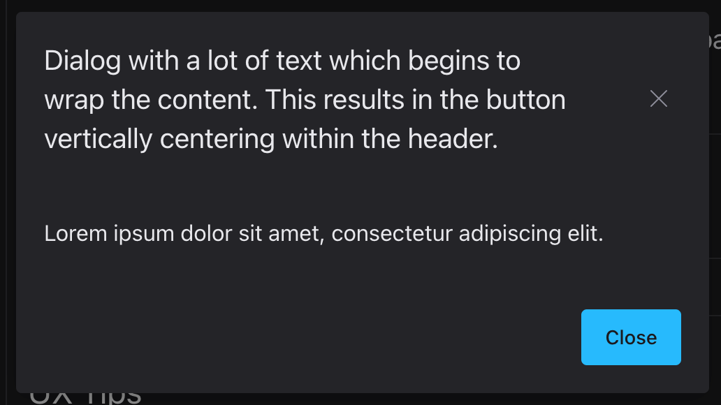
You’ll need a bunch of other styles to finesse the size of the floating element and button in relation to the content. The final result should look something like this:
Let me explain what’s going on here. In the demo above, the blue box represents the span.floater element dimensions. Note that because we’re using position: absolute; for the button element child, it’s not visually inside the span.floater but instead positioned relative to the surface. We set the dimensions of the span.floater so that the content won’t collide with the dimensions of the button and instead wraps around it.
You can remove the demo attribute from the <closable-surface/> element to see the final result without the blue box. I’m using a custom element so that it is easy to edit the content without accidentally altering the markup meant for the buoyant button.
Try removing the title, editing the content, or resizing the window. The content should never collide with the button and always sit at the top corner.
#make-floats-great-again