

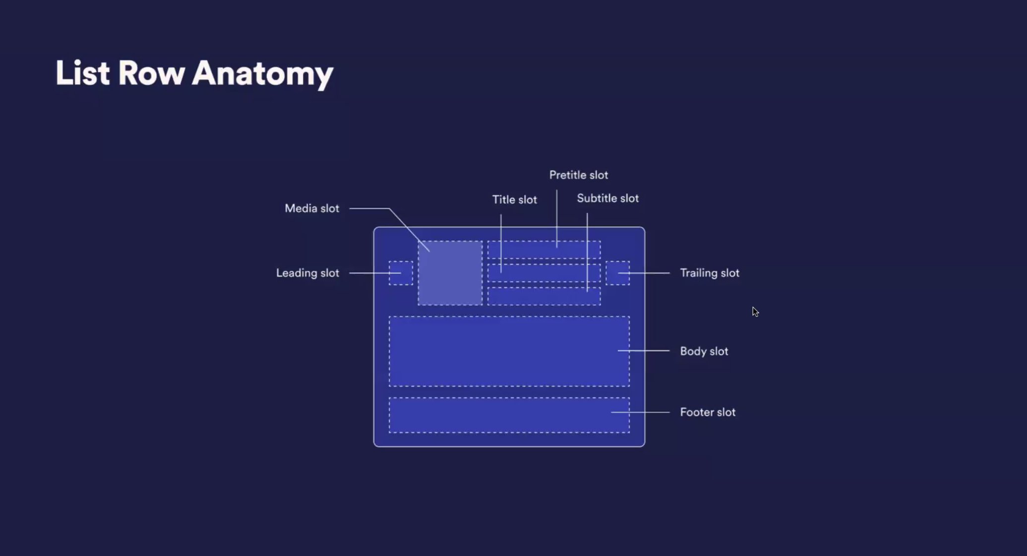
Naming is clearly something I think a lot about. So when I saw this tweet from Nathan Curtis about the way Shaun Bent and his team at Spotify handle component composition has named slots, I was triggered. Hot takes activate, here’s the image from the tweet:
Pretweet
There are several words in here that suggest position. For this exploration, I’ll focus on the title area, specifically the areas above and below the title slot. The team has chosen the words pretitle and subtitle for these areas, respectively. Seeing this, I went through the following stream of thought:
Initially, I’d expect that the concepts should match. In other words, choose either pre/post or super/sub. There’s awkwardness in both choices. Choosing the former pair will result in a double-t (posttitle) while the latter pair will result in a suggested size of the title from the name (supertitle).
I’ve recently adopted the concept of “overline” from Material Design for the area above headlines. While it might work using the word title (eg., “overtitle”, “undertitle”) it wouldn’t for other typographic terms as we may end up with a very confusing “underline”.
Which is where I decided I couldn’t just reply to the tweet. I’m now conflicted about what I would name these areas so that they are clear to their purpose and relate to the title component appropriately. We need to go deeper.
A Page from Page Layout
The parts we’re identifying here are from the anatomy of page layout; the arrangement of visual elements on a page. There’s a handful of parts that we should first address that could help us here:
Headline
This is meant to be the most important element in the layout. As such, we expect this to have the largest font size and/or most ornate font style to capture the reader, along with its compelling content to continue traveling down the path it introduces.
Deck / Kicker / Intro / Stand-first / Lead / Lede
This often summarizes the article and appears directly after the headline. It is meant to further engage the reader to move forward in the reading experience. In terms of treatment, we expect this to be smaller than the headline, but larger than the body copy. Due to the nature of there being multiple words to describe this idea; there are also many variations of expectation for this in terms of length and content.
Subhead
There’s some disagreement in the research I’ve done that identifies this element. In some examples, this is a synonym for deck but for others, it is specifically meant to break up large chunks of text.
Drop cap
This is often the first letter of a chunk of text but can sometimes be longer than this. It is stylized to be larger than the rest of the body copy it is associated with. We have ways of achieving this using CSS pseudo elements such as ::first-letter and ::first-line.
Byline
This is specifically the line of text that identifies who wrote the piece. It is used mostly for authors writing articles and begins with the word “by”.
Dateline
As you might expect, this is meant to present the date that the piece was reported however, according to Wikipedia, it also describes where and when the story was written or filed, though the date is often omitted.
Caption
This is text used to describe accompanying media such as images, photos, or illustrations. We will also see captions in media outside of page layout such as video in the form of closed captions. While we expect this text to be smaller than most body copy, it must be still legible. Importantly, captions are also subtitles that include a written description of other elements in the media.
Folio
This is meant as metadata about the piece, often including the publisher’s name, page number, or year of publishing. This is often in the corners of printed pages in a smaller and less distracting typographic treatment.
Running head
This is meant to connect a story over multiple printed pages. On the web, this is less apparent as we have ways of allowing the headline to remain on an infinitely scrolling page.
Pull quote / Call out / Billboard
This is meant to highlight a particular topic or mention from the existing body copy. It is often displayed inline within the layout with a more engaging treatment, either by size or style.
Disambiguation
Many of these are often used interchangeably and have more meaning. For example, the difference between a headline and a title. From the English Language Learners Stack Exchange:
“Headline” is normally used when an article appears as one of a collection of articles, such as a newspaper. If the article is reprinted separately, the headline becomes the “title”.
Another description of this difference is by the Content Authority, providing this table of examples:
| Headline | Title |
|---|---|
| How to Improve Your Writing Skills | 10 Tips for Better Writing |
| Why You Should Drink More Water | The Benefits of Staying Hydrated |
| Breaking News: Earthquake Hits California | 7.1 Magnitude Earthquake Rocks Southern California |
In HTML web pages, the title is a metatag meant for the <head/> of the webpage and is displayed outside of the content area of the webpage; either in the browser window or tab area. Meanwhile, the idea of a subtitle could be confused for the use within captions.
Purpose not position
You may have noticed that much of the descriptions above do not suggest the element’s position in the layout, but rather its purpose. This is the reason why the original tweet was so triggering for me. When we provide an API that is driven by placement, it allows different variations of lockups to emerge because the person supplying the content is less likely to truly understand why they want this treatment. It becomes much harder to have a consistent presentation of these elements.
That is why when we create a component like this, we should be preparing it by purpose. This will ensure that what the designer decides is done by intention. Where it is finally displayed is a separate layout exercise. As an example, in magazine layout, an article’s author does not have authority over the folio position. Less artistic articles may also have more restrictions on other elements such as the style of headline, deck, and body copy. This keeps the presentation consistent across the publication and readers become more familiar with the presentation; making it easier to read.
Going back to the original example at the beginning of this article, I’d now recommend the following based on the above:
- Headline slot
- Lead slot
- Media slot
- Caption slot
- Body slot
- Folio slot
- Callout slot
I’ve omitted the leading and trailing areas specifically because the names do not suggest purpose, only position. In other words, what is supposed to appear in these spots? If the answer is “anything you want”, that’s not systematic. One person could decide that the icon is meant to appear on the left while another expects that same icon on the right.
As a practical example, the button component I’ve designed allows for an icon prop which only appears before the button’s label. The only way to have an icon appear after the label is for special purposes. For example, showing a caret when the button is meant to host a disclosure pattern.
<Button icon={ <Star/> } as='disclosure' />With this API naming scheme, we can create several kinds of lockups. We could have a <ListRow/>, <MediaCard/>, <Hero/>, or any other component which expects a hierarchy of content. We could also have different layout options specific to each once each of these is well-defined. Ones that allow the folio to appear above the headline as an example. The exercise of determining where each one of these elements goes should be separate from the exercise of curating the kinds of elements that need to appear and their content. In fact, designers often aren’t curating the content here. The decision about which kind of lockup to use might be the only decision required in some cases; such as widgets of a CMS.
The opinion about where these elements should appear or how many variations exist should be influenced by the designers interested in these layouts but ultimately consolidated by design system governance to align on a common shared language by intention. Designers must articulate their needs past ego and identify how their choice is targeting a user’s need. That then informs this new API.
Overall, I continue to recommend naming things with purpose.