
Design tokens for color and typography are fairly common for design systems. In particular, color token naming has finally gotten some traction by thinking semantically. In other words, not naming the color based on the value but the intent to use. Typography is getting some traction here as well; where naming is done by use. This tends to be easier to understand since a type style is composed of many different properties.
Spacing, on the other hand, has been locked into the original token naming scheme where the name of the token relates to the value of space; not the use. Tokens are either named using T-shirt sizing or numbers with a scale of several to use.
The importance of using semantic tokens is to limit the decision making for the designer. The designer should focus on crafting the experience in a wireframe-like mindset. Color, typography, and other styles are noise that distracts from solving user problems. The design system should have the guidance to make clear decisions and reduce the noise.
So the question is, how do we give meaning to spacing tokens?
Relationships
The Gestalt principle of proximity describes that elements that are close to each other are meant to be considered more related to each other than elements more far away. This is the principle we as designers are implementing when we decide the amount space used between elements.
But how do we choose exactly how much space? Often times it’s looking at the whole page and picking what feels right with a few constraints (like using multiples of 8 for the values). However, the system cannot give guidance about feelings, it should have clear reasons as to why to choose an amount of space.
The way I’ve identified an amount of space is by social relationships. Degrees of separation describes the way that entities are social connected to each other. We can think of parent-children or siblings that live in the same house to be 1 degree of separation from each other, while next door neighbors might be 2 degrees.
Now, if we consider these entities as elements of an interface, the parent-child and sibling relationships translate. The parent <ul/> element and its children <li/> elements can have 1 degree of separation; meaning they are very closely related. While the <ul/> element and its <body/> ancestor element may not be as close.
Keep this in mind as we review the next topic; density contexts.
Density contexts
I spent a great deal of time gazing at the first image in Nathan Curtis’s post about Spacing in Design Systems. Here’s the image from the post:
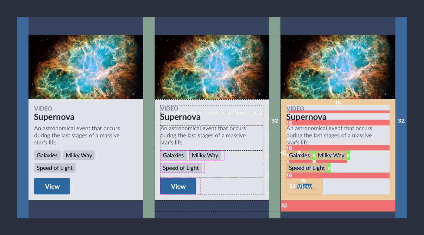
If we were to use the mental model we’ve come up with above, the tags within each card are 1 degree of separation apart from each other; in this comp a value of 8. The paragraph above is different from the tags, or in the next house. That can be described as 2 degrees of separation between the paragraph and tags.
All of this works fairly well within the card, describing all the relationships of detail and space within. Where this is fuzzy is the cards themselves; each card is clearly an indentical sibling of the next and by our rules should have 1 degree of separation between. That was previously shown inside the card as 8, but here it is 32 and this feels correct, but how do we describe this?
The answer is density contexts.
Every time we dive deeper into the content of the page, it is an opportunity to reduce the density of the area. This would reduce the amount of space around and between elements but maintain the relationships we aim to describe.
Let’s say, we start at the <body/>. Lots of space between sections of the page because they are very unrelated. Maybe one section includes a card layout like the one above. We then shift the density down one notch and tighten the space between the children in this area. Going down into a card, we shift another notch down and tighten further showing that this content is most closely related.
So each new density context defines the way space is used within that context. If you want less space between items because you want to show a close relation; add a new density shift and all the space within will reduce. This allows for the space between each card and the space between each tag to both be 1 degree of separation but the resolved value to be different because we are in a new density context.
Now the designer chooses the density context for this particular experience but what about the actual token names? How do we give meaning to the locations where the values should be expressed?
Padding and gap
We can think of padding as the space around an element and the gap as space between elements. In the cards referenced within the image above, we can use these definitions to describe the spacing used in most of the elements.
- Spacing between the tags is a gap.
- Spacing between the headings (video and supernova) is a gap.
- Spacing between the headings, paragraph, tags, and the button is a gap.
- Spacing between each card is a gap.
- All other spacing is padding.
Each time the value of the gap changes signifies a density shift downward. First we start at a density where the gap equals 32, then we shift down (within the card) to a gap that equals 16, and finally we shift once more (inside each part of the card) where the gap equals 8.
So do we just use token names that describe padding and gap? Almost.
Tying it together
Going back to degrees of separation, I realized that trying to define larger degrees of separation would be difficult, especially when naming them with meaning. However, after compleing the exploration and identifying that there are really only two places where we need to apply space (around and between), that means I could reduce the number of spacing tokens down to 2 for most usage. That resulted in the following two names.
--spacing--near: often used to describe the spacing between elements showing close relation.--spacing--away: often used to describe the spacing around elements showing less relation.
I use near and away because there are areas where we want to use these values that aren’t confined to the guidance above. Buttons are the best example, where we want the space on the horizontal axis to be greater than the vertical. Setting button { padding: var(--spacing--near) var(--spacing--away) } doesn’t break the mental model as much as if we used the word “gap” within the padding values for the button.
And that’s it, you can create an interface in terms of relationships and density systematically with a very small number of design decisions with clear guidance. Below is a Codepen where I’ve recreated the card using this approach:
+ Typography
You can take this one step further by including typography. If you consider that each use of typography is included into a category, the type scale could ramp based on the density instead of in isolation. This allows for a clearer relationship between typography and space as many designers strive for through vertical rhythm and a grid system.
If you identify categories of typography with proper guidance for each you can connect the density to the category. Body text becomes larger in hero images and smaller in general areas. Perhaps even smaller for data-dense interfaces like tables. Each area uses the same type style but the density changes the size.
Real world examples
If you’re interested in how this all works in a real site or system, the damato.design family of sites all use the above approach to determine spacing + typography, including this site. I will admit determining where to add the density shift is the bigger challenge but what helps is to identify where the --spacing--near and --spacing--away values should go first, then determine if the density should shift as the second step.
One more note, in the DAMATO Design System, we do not have many typography categories; only display, heading, standard, and detail. This restricts the number of heading levels to only display and heading which loses content hierarchy unless shifting density. We could include more typography categories to describe a few additional levels (title, subtitle, etc) but opted to exclude for simplicity.