
One of the concepts that bothers me about our practice is the amount of effort we put into tweaking designs. Where we only have a handful of designers visiting our products, we have thousands (if not more) of non-designers just looking to get something done. They aren’t thinking about how the button looks, they are hoping that it’s the last button click they need to finish a task.
After so many years and billions of websites, we should have a very accurate understanding of how people expect the web to behave. So it would make sense to have components that are the canonical standard for a certain experience. We have some of these already on the web, such as the native HTML <select/>. However, we often insist on knowing better. So we create custom versions of these with varying success. Maybe, we have too many items within that list and want to allow the user to more easily find options. There’s no native HTML element that handles this completely, so we’re invited to solve it for ourselves.
Global Design System
As mentioned in a talk and formally announced this week, Brad Frost is calling for a Global Design System. For folks who have managed design systems resources and reinvented wheels for several years, this seems like the obvious next move. An ultimate headless component library that only needs some values to present new expressions. The idea is taking what the Open UI Group is doing and truly standardizing it so we barely need to build interactive functionality from scratch again. The main work would then be mapping our brand expression (along with other design choices) to these existing resources.
Many of the skeptics of this idea are worried that the implementation of this system wouldn’t match their current ideas. From my perspective, I’m counting on that.
There are countless examples of poor UX. These are often reshared as good because some larger company has done it. I’ve spoken about this problem before. This is where we get <div role="button"/> and other highly questionable decisions. We often believe that our exception is justified when in reality we’re biased to our own beliefs about how an experience should behave. If we all agreed that a button should look like a button, act like a button, and legitimately be a <button/>, the skeptics have no platform. In fact, we’d probably already have a Global Design System because we would all agree.
But we don’t all agree and I think that’s because the folks that don’t also don’t have accurate data. Think of it like Flat Earth. Data is available that says <button/> is the best way, but folks who don’t know the data challenge that notion and veer in a new direction looking for a new truth that they claim works just as well.
So it would seem I’m a proponent of a Global Design System and I’d certainly be one. But I honestly think it’s too late.
A new kind of interface
I submitted a talk for Config last year which was about AI. At the time, AI was just emerging as the newest disruption in tech. While I certainly had plans to touch upon its upcoming impact in our daily work, I also wanted to touch upon the possibility of how we might consider the effects for the larger population outside of design. Remember, we design products for people; all people at best. So I wanted to explore what AI might mean for folks in their normal day-to-day. As you might know, I wasn’t accepted to present that exploration but as always actions speak louder than words.
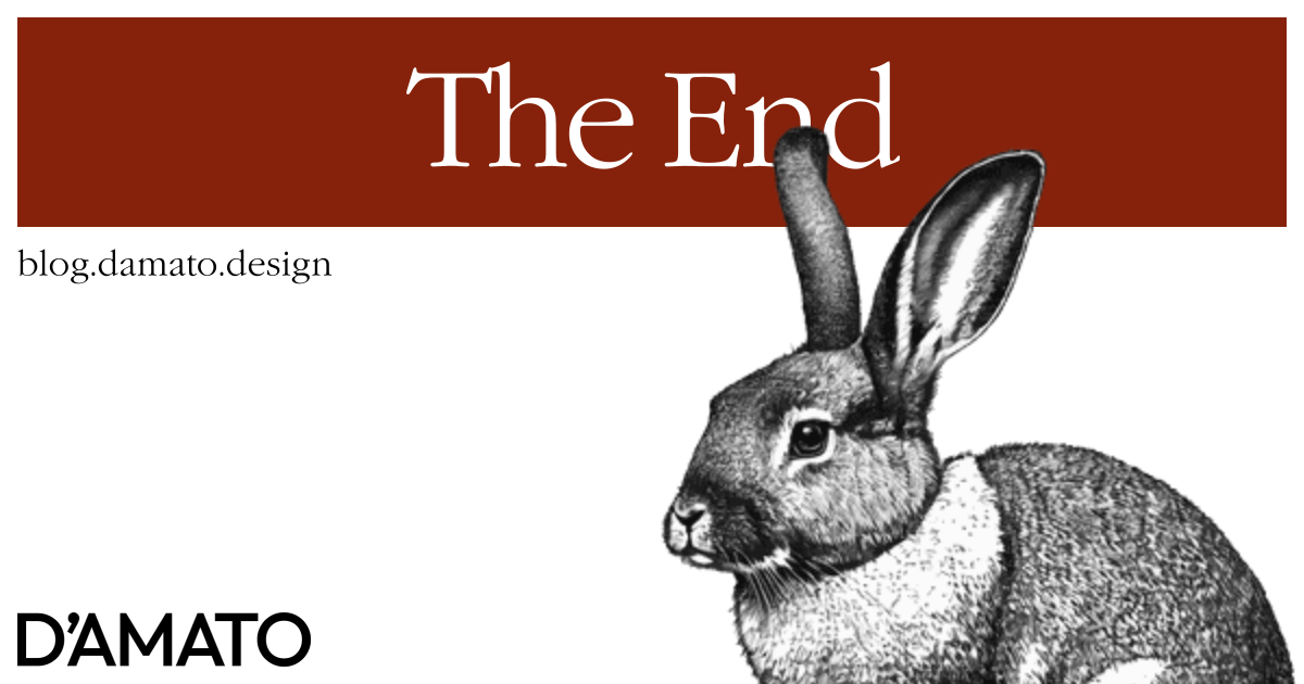
There’s been some buzz at this year’s CES about AI, and much about a new company called Rabbit. I recommend that you watch the Keynote on their website, especially if you are a design systems practitioner. If you’re like me, you should have some strong opinions about what is next for us within the first few minutes.
The idea is that this technology has introduced the concept of a LAM (Large Action Model), which is meant to understand how user interfaces work and can execute tasks on them in the same way a person might. This means that there’s no need for a service to have an API to hook into, and no need to connect services together for chained commands. In this voice-activated experience, the end-user doesn’t even see the interfaces that are being worked on. They just need to confirm that the results were expected.
If you don’t understand what this means for us, I’ll make it clear. The introduction of LAMs could be the end of our practice as we know it. If the public only needs to interface using their voice to complete a task on your product, what the GUI looks like is meaningless. There is no value to the look if the user never sees it.
What do we do now?
This is the question we need to ask. Not, what’s the best design token naming convention? Or, how to support perfect nested rounding on corners? As a design systems expert, what expertise can I offer in the field of non-graphical interfaces? Personally, I don’t have an answer for this yet but, you can be sure I’m thinking about it.
Importantly, I also don’t believe this is a change that will happen very soon. VUIs are still in their infancy in comparison to GUIs. Interpreting natural language requires much more computational work than having a user choose to click a button. That process of identifying a user’s intention and translating it to an action on a customized interface that our brain would normally handle is now being handled by a LAM. This would mean that people would need access to that computing power and is not wholly accessible worldwide. The human brain currently requires fewer resources and has a better means of understanding, so it remains the primary actor in the field of user experience.
Another way to think about it is offloading the complexities of user experience onto systems, reducing the user experience to nearly zero. But what about those moments of delight, you say? Now experiences are lifeless! This is where art has been confused with design. The user experiences being targeted are task-based and tasks are commonly not fun. We’ve added moments of delight to make them feel like they aren’t tasks. Your product has been a necessary hindrance that you’ve made slightly more fun through small moments. However, this concept considers removing the tasks entirely. So the delight that the user is looking for is accurately not your product, but some hobby or IRL experience instead; like seeing art for fun. Imagine the amount of time saved planning a trip when you don’t get lost in the number of tabs you have open, doing cross-site comparisons, and trying to navigate the same data displayed in different ways because of branding or some other design bias. Time to spend doing things that are actually fun.
So, take a moment from color shades to think about the future. Our users will thank us for it.