
In a world where we apply personality to every little interaction for those sweet engagement metrics, the :hover CSS pseudo selector is one of the easiest ways for folks to “make it pop”. However, I’ll argue that perhaps we don’t need to put so much design into it; at least from a token maintenance perspective.
Looking good, feeling good
It is very common to have colors of a button change when a pointing device hovers over an interactive button. We often design for this because we’ve seen it before. It just feels right. You could argue it might not look interactive if it didn’t respond to the incoming cursor. Even the default user-agent button has a hover effect, how could one possibly defend not including this effect?
To start, let’s look at the default <a/> element and how that behaves. You’ll notice that most user-agent defaults don’t have any color change for the text. I’d theorize that there are two reasons for this. First, accessible text color is a challenge, especially when attempting to show a shade change on glyphs that are only a few pixels wide. This is the reason why most of the effects we decide to put on links are not color changes, but some other visual treatment like an underline visibility change or animation.
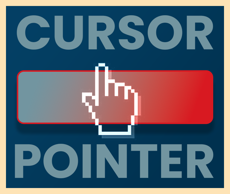
The second reason is the foundation of my argument; the cursor changes when you hover on these elements.
When a sighted user sees something they assume is interactive on screen, they’ll find the cursor and navigate it to the target. Once the cursor is in the interactive area of the target, it is common to provide feedback to the user that says we are in an interactive area now, clicking here will do something. The cursor change on links is enough of a signifier to the user that you may interact with this special text.
For the default user-agent <button/> styles, the cursor does not change. It remains the default arrow cursor.
Making change
The reason for the cursor difference on hover between links and buttons has some history and can be otherwise debated.
— Adam SilverThere’s a belief that the hand (pointer) cursor means clickable, but this is wrong and potentially problematic.
The issue with this statement is there’s nothing (past technical specifications) that tells daily users of the web the pointer cursor means you are hovering on a link. We have introduced the pattern of the cursor change for buttons, and for general interactivity, over time through shared expectations. This can be thought of as similar to the hamburger menu, which originally meant nothing to most users but has been learned over time; even if other more verbose design patterns exist. The hamburger menu has become ubiquitous, as has the pointer on buttons.
Due to this learning, I believe we could leverage the cursor change in the same way it has been done for links; the sole indicator of an interactive area awaiting your next move. That’s right, no color changes or fun 3D effects. Just a single pointer.
Form follows function
If a user is confused about an interactive element being a link or button, it does not come down to the type of cursor chosen. The Button vs. Link debate is mostly rooted in resting visual preference. Users expect underlined text to behave like a link. While text elements with padding and colored backgrounds often behave as buttons. Our users have grown to identify these patterns through repeated experiences across dozens of sites per day.
It would be beneficial to supply our users with expected experiences as any deviation can cause unwanted friction. A button using an underline and no padding will behave unexpectedly to a user, no matter how pretty it is. It is advised to offer sensible design treatments that maintain user expectations and common functionality.
Importantly, users will often use their eyes to identify and develop their expectations before ever moving the mouse to the target. This happens before the cursor has the possibility of changing. They are quickly making assumptions about what the target can do, all before they ever get a chance to hover it. And for folks not using their eyes; they’ll never experience the effect at all.
In the wild
I’ve gone through the 123 implementations of the button component at the Component Gallery; how many of them don’t use the pointer on hover? 6; 4% of all buttons found on the site do not change the cursor on hover. While the Bandwagon effect can certainly be a factor, this is most likely from patterns forged from real-world use. Know that the first interactive area on the web was the link, so we have grown to expect the pointer to appear as an interactive identifier in other areas in turn.
Further considerations
- For folks who aren’t using a mouse to navigate, they need focus styles. The hover effect might not ever be displayed to these users. As a more complete recommendation, focus styles between interactive elements should match so a user can follow a standard identifiable treatment across the site.
- For folks on touch devices, hover doesn’t exist except for some fleeting finger presses that occur after the interaction. In most cases, a person’s finger will otherwise obscure the effect when provided.
- Using the cursor alone also avoids the need to curate specific colors for every type of button. No need to have a separate color for the default primary state and primary hover.
- For buttons that have a selected state; omitting separate styles for hovering helps avoid the need to define a different appearance between unselected hover and selected hover. Otherwise, the number of definitions will increase not only for
:hoverbut now include[aria-selected="true"]:hoverfor every single type of button in your library. - In CSS, instead of specifically writing a
:hoverstyle, thecursor: pointer;can be written on thebuttonselector. No need for a new selector at all!
Consider a vote for cursor:pointer today!
Telling the truth
In reality, I don’t believe that a single cursor change is enough to indicate interactivity. A best practice of experience design is to have multiple signifiers to indicate new information. This is why using only color to indicate an error isn’t enough. It is better to include an icon to further enforce the status of the new message or state.
In this way, instead of choosing an entirely new color to indicate hover, one recommendation could be filtering the given color in some way on hover.
button:hover {
    cursor: pointer;
    filter: saturate(0.8);
}
For many colors, a slight shift in saturation should not cause accessibility concerns past what has been curated for the default state. If this approach causes the resulting color to not provide enough contrast between the text and background, that might mean the initial color itself is too close to the threshold and would serve better with more contrast. On the other hand, if the change isn’t perceptable to color-deficient folks, the cursor will be enough to indicate the intention, as suggested above.
In my perspective, there are often too many tokens to curate and anything that can be done to reduce the set and subsequent naming of additional tokens is a step in a maintainable direction. Omitting the hovered state as a themable variable helps reduce complexity and permutations.
Perhaps, we need a new way of looking at the ecosystem.
— Mark A. CianfraniDesign system business model where you have to pay for every token you use.
This isn’t the model we deserve, but it’s the one we need right now.