
My wife asked me a question one morning:
Are there any good reasons why a button should have a min-width?
My quick response was “No” and she agreed without much contest. However, I figured I’d ask the internet to see if there were any reasons we might have missed.
Moving forward, we assume that the button we are designing is the smallest possible in any particular set, as larger buttons will be less susceptible to the issues we’ll be addressing.
Accessibility
One of the big blanket statements in the replies was related to accessibility. Specifically citing WCAG 2.5.8 AA which says:
Undersized targets (those less than 24 by 24 CSS pixels) are positioned so that if a 24 CSS pixel diameter circle is centered on the bounding box of each, the circles do not intersect another target or the circle for another undersized target.
It’s important to note that 24 CSS pixels is a minimum and the better practice is to have target areas that meet the WCAG 2.5.5 AAA of 44 CSS pixels.
There are plenty of situations that we could imagine where a larger target would be helpful:
- For folks using a device in a moving vehicle.
- For folks who use less accurate pointing devices.
- For folks that lack fine motor skills.
My stance on this is that button construction will contribute to the overall accessible size using styles like padding and the existing content to meet this without much more to add. Additionally, buttons with words inside should have the proper content that is descriptive and avoid vague labels like “OK.” More on this below.
Localizaton
Having a more descriptive label doesn’t necessarily mean that buttons with only two characters won’t exist. According to Mike Mai, it’s common for pages that display CJK languages to have a button with only two characters.
Meanwhile for languages that would cause the button to be larger than originally designed due to translation, a minimum width would be easily exceeded. In an example I’ve used before, the words “Buy Now!” translated to Mongolian results in the text “Одоо худалдаж авах!” overshooting any reasonable min-width that might have been applied. The min-width is intended for when the label is too small, not when it is large.
Speaking of when a button has a long label, we should not truncate the text in favor of an ideally sized button. We must curate the label in such a way that it is descriptive and concise. If the text must wrap, let the text wrap and continue to be wholly visible. I’ve written a bit more on this topic recently.
Icon button
It is also not uncommon to have a single glyph within a button in the form of a square icon button. If the button is meant to be a square, then its width and height should match by definition. Since we’d most likely want a standardized height for buttons so they align with inputs and other text elements, the width would be naturally restricted to this recurring height.
Therefore, the smallest button in the library should be the square icon button which must meet WCAG 2.5.8 AA as defined earlier; a minimum of 24 CSS pixels in both dimensions. No minimum width would be apparent when set in this configuration using only an icon. The minimum width of the icon button would be the size of the icon plus any additional padding and borders, adding up to at least 24 CSS pixels but optimally 44 CSS pixels.
LooksGood™
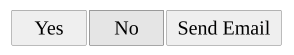
There are plenty of responses that provide the opinion that setting the min-width will make buttons with smaller labels visually more appealing than without. Such as if there were two buttons labeled “Yes” and “No”, the designer might expect the width of both buttons to match in size. There isn’t any data from a usability perspective that I could find that supports this design choice as beneficial. It is a matter of subjective design preference. I also believe that better content design would make this unnecessary. The need for a min-width presupposes that the content in the offending button could be improved with a more descriptive label.
Other points
There was a point that listed predictability, consistency, and readability as factors that would involve setting a min-width. In the cases of predictability and consistency, the visual treatment of the button using color, typography, and other styles would contribute more to these factors than the width. I’d even argue that a min-width button would be less visually consistent than one without because of the horizontal padding. A “Yes” button with a min-width set would be perceived as having more padding than buttons that don’t reach the min-width.
Meanwhile, if all buttons were perceived to have identical padding, this would be a more consistent visual treatment. In the case of readability, this is determined by font metrics, icon design, and color contrast, not the width of the containing element.
Another point shared was about buttons in spatial computing. Admittedly, I’m not well-versed in these interfaces so I asked some questions about the interaction design for these. According to the thread, these buttons will grow as you gaze at them with your eyes, indicating that a particular button is an intended target. The button is commonly triggered using a pinch but could also be by finger touch, which aligns with earlier recommendations discussed above. I’d also imagine that visually small buttons could be made larger by changing one’s perspective similar to how browser zoom controls would work, but without the layout shifts.
The only reason
So if we were to assume that the button is designed in good faith, with appropriate padding and borders, using legible font metrics and color contrast, and having either a well-identified icon or descriptive label, that this button would not need a min-width to be set.
However, there is one reason why we might want to consider setting a min-width and it has to do with CSS Flexbox. Kevin Powell has made a great explainer video speaking about the behavior so I recommend watching it for more information. The tl;dr is that because most buttons these days are designed using Flexbox, then I’d recommend including the following rule with the declaration to help with text wrapping when it’s needed:
button {
    min-width: 0;
}
Without it, it’s possible that text within the Flexbox could overflow outside the shape as an unintended consequence of responsive behavior and translation. It’s important for the content to flow naturally, and setting this rule when using Flexbox helps support that expectation.
So from a design perspective, I’m not convinced that setting a minimum width for the button has a reason for usability as long as other aspects of the button are well designed. From the engineering perspective, setting min-width: 0; on the item will help support content wrapping.