
This topic was sparked from a few discussions on Twitter. On one side there’s a school of thought that believes the size of a button should be achieved with padding. On the other side, there is also a belief that the size of the button should be handled with minimum dimensions. I have a strong opinion which is based on the principle that the size of an element is dictated by its contents and therefore I believe padding (along with other properties) should be the general basis for size.
Minimum size
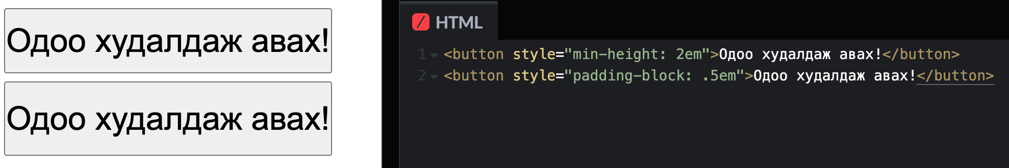
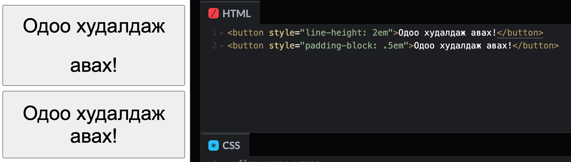
If you are purely using min-height to determine the size of the button, you aren’t accounting for the possibility of translations to your text. I’ve explained in the past that some words are translated to be much larger than initially provided. In that example, the words “Buy Now!” translated to Mongolian result in “Одоо худалдаж авах!”, something much longer than expected. In layouts with limited space, we will want to wrap the text for it to remain visible.
In the following example, both buttons look similar in height, one using min-height and the other using padding-block (vertical padding).
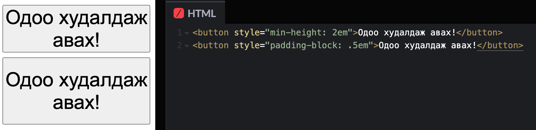
In this next example, we reduce the available space. If we purely use min-height for the button to determine its dimension, we will lack space between the upper and lower edges of the button. Meanwhile, including padding in the button will ensure that there is always space from these edges; giving room for the text to breathe and not feel cramped.
Note that in these examples, I’m not including space in the horizontal direction. I’d argue that we’d also want to use padding here as well.
Line height won’t save you
Perhaps you have a personal vendetta against padding and want to do everything in your power not to use it. You say the line-height will provide the additional vertical space I need! And yes, it might but at a cost. Here’s what that looks like using the first example, replacing min-height with line-height to get a similar size with padding.
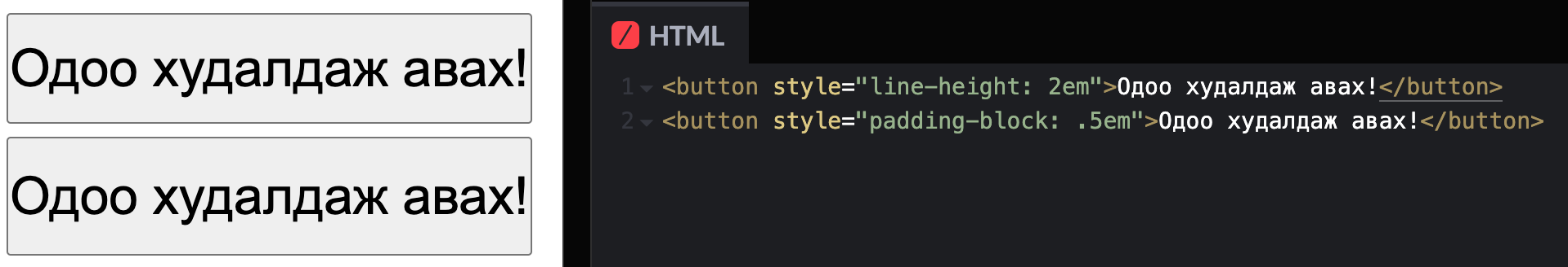
Now, here’s what happens when the text breaks onto two lines.
You’ll see that the line-height causes too much space to appear between the lines in the first button. This is expected because that’s the purpose of line-height; it’s meant to control the height of each line. While we don’t expect a button to wrap to multiple lines and cause this wide gap to appear, we should still be prepared for it.
Also, know that the resolved line-height value will be presented differently between different fonts and their metrics. I love recommending this post by Vincent De Oliveira to deep-dive into the differences. So if you don’t want the size to be related to the font, then line-height isn’t your tool.
Set the line-height value based on what you’d like to see when the content wraps to multiple lines. This goes for any prose, not just the button. You should not be setting a line-height value when looking at only a single line of text.
Why not use both?
Because it’s redundant.
The padding contributes to the height of the component (along with the line-height). So as long as there is content inside the button, the button will be the same height related to the content within it. min-height is only useful if we expect the button to not have any content within it and that should never happen. If it does happen, you have larger problems than the height of the button.
Mixed content
Now, I’m sure you are already thinking of an exception where there is mixed content in the button; specifically an icon with text and those elements do not share the same height.
There’s a great deal of nuance in this area, but the bottom line is that you want the space that the icon occupies to match the line-height of the font it is paired with. This may mean that you’ll include a negative margin-block using a unit related to the current font metrics to get the appropriate optical placement without adding to the overall size.
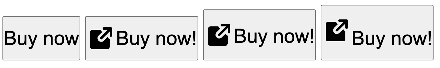
In the above example showing buttons from Adobe Spectrum, placing the icon on the font’s baseline would not vertically center the glyph. We must offset this at the icon. Here’s an example of a few approaches, all with the padding-block property set.
- Button with no icon.
- Button with icon using negative margin related to the font metrics.
- Button with icon using
vertical-alignrelated to the font metrics. - Button with icon without alignment adjustments.
In the second and third examples, the icon is optically centered with the text. The difference is how much the icon contributes to the button height. In the third example using vertical-align, the height still contributes to the overall size, causing the button to be much larger when an icon is provided, even while centered with the text.
Using the negative margin with the correct value can also be used when text does not appear within the button. Here’s the same example as above, now with an icon-only button which also uses the negative margin value.
I’d suggest that your icon component should be built in with a negative margin based on the current font metrics. Getting the font metrics to behave isn’t easy but some CSS properties are coming that might be useful. This is especially critical in a themed ecosystem as the resulting value for the negative margin will change depending on the font properties for any given theme.
Thoughtful units
Here’s one final hot take, and it happens to be an argument against what I’ve previously thought in the past. Consider not using (r)em for size/space. 😱
Josh Comeau has an excellent demo of this in his post. The reason why we apply space to anything is often meant to show relationships between elements. In the case of the button, we are applying space for an additional reason; to increase the size of the target for better clickability.
If the font size were to increase due to the user’s zoom, the target area would become larger as a result when the content dictates the size of the element. We do not need to also increase the space surrounding the button; the resulting content size is enough to click. In this way, the padding is effectively contributing to the minimum height of the button.
In the other direction, if the user wants to decrease the text size, using a padding size that ensures a proper target area is available is recommended. Decreasing the text size is less common than increasing but could occur in areas where data is meant to be dense, like in a table to view more information.
- If you want the size/space to be affected by the relative font size, use
em. - If you want the size/space to be affected by the user’s font size preference, use
rem. - If you want the size/space to remain the same regardless of these settings, use
px.
I’d now argue that the final one is more appropriate than we might realize when it comes to relationships and user settings. The user is generally increasing their font size for legibility and has very little to do with increasing visible space between elements. Meanwhile, the user still has the option to zoom, which causes everything to be larger for nearly any unit being used.
It is still important to use relative units for typography.
We should be deliberate in the reason why we choose to make these design decisions and keep in mind that we have very little control over how a user might want to experience the stuff we make.