
From the days of working with design tools like Photoshop, layering compositions in 3D space on a computer has been part of the job. Managing what appears on top can be dozens of elements, maybe even groups of elements, and carefully curating the order of the layers is often a necessary unit of work.
As you can expect, this sort of exercise has translated to the web, and traditionally we think the z-index property is meant to manage this ordering in a similar way to how layers would work in a design tool. When you are working alone on your own project, this is reasonable because you are in control of the elements, the order, and the composition as a whole. You can decide if the z-index you added yesterday isn’t good enough today and make modifications. You can tweak this part here, and make a small change there to get everything just right. In fact, I use z-index right here on the blog in a few specific places to get things looking just right artistically.
But for larger teams where elements are coming together from all across the organization to be composed into a single experience, trying to manage z-index is a political battlefield. It’s not possible to just make a --dropdown-elevation variable, because that dropdown might be on another surface that itself has an elevation higher than the dropdown.
Popular public design systems like Shopify Polaris include z-index tokens which don’t mention where the token is meant to be used, we just know they exist.
There are certainly attempts at making sense of this. A recent article on CSS-Tricks suggest naming the elements where they are expected to appear. Semantically, this makes sense on the surface. But as mentioned earlier, it’s very possible that a flyout that is normally underneath a modal is meant to later be on top of it. And it would be inappropriate to make an entirely separate component meant for “modal dropdowns”. Maybe it’s OK to set your own z-index? Well, how do you know it isn’t conflicting with another element that will appear later in the lifecycle. You’re essentially playing whack-a-mole, goldilocking the perfect z-index value, tokens or no tokens.
But what if you didn’t need z-index at all? There’s two approaches I want to highlight and both related to a very simple concept. Elements are visible in the order they appear in the DOM.
Top layer
For what purpose do we set elements in 3D space on the web at all? Certainly, we can stylistically show something is a little bit raised for some personality but when we are creating flyouts and popovers, why are we using them. Overall, these are meant for focused attention. The user was currently navigating the general interface but needs to either focus on something further to continue. Sometimes that’s to choose an option, or maybe be notified of something. This means that there’s a hierarchy to what is being presented. This thing is currently important, then this thing is important, and so on. So this means as we introduce elements to the user, this is conveying a sense of importance. The most recent thing that is added, is the thing the user needs to see more than any other.
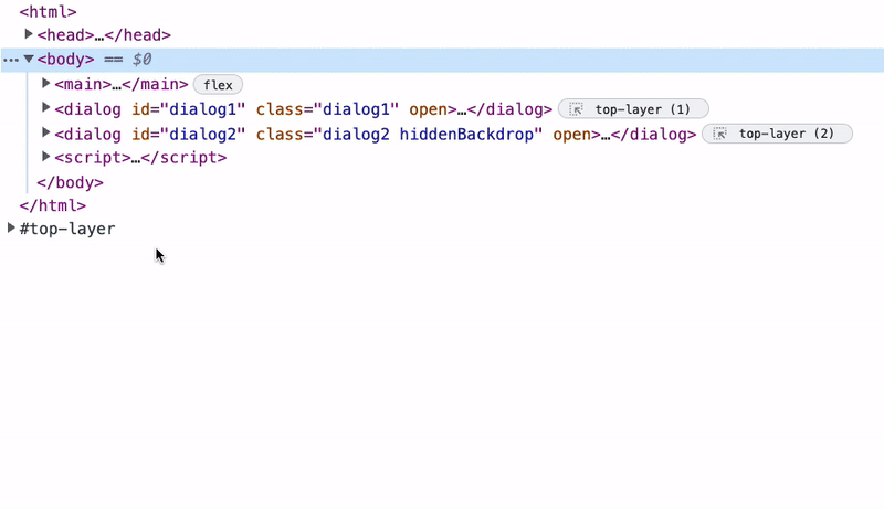
This is how the top layer works in HTML. It is a separate layer from the rest of the DOM where anything placed within it will be on top anything that would be placed in the normal DOM. No amount of z-index can place elements higher than the top layer. Additionally, z-index doesn’t work in the top layer. So your question might be, how do I provide the correct order of elements? The order of the elements is how they are added to the top layer. That way, if you want some messaging to be the newly most important thing, you simply append it to the top layer.
Elements that can apepar in the top layer are restricted to the following according to MDN:
- Fullscreen elements, i.e., elements that have been caused to display in fullscreen mode by a successful
Element.requestFullscreen()call. <dialog>elements displayed as a modal via a successfulHTMLDialogElement.showModal()call.- Popover elements shown via a successful
HTMLElement.showPopover()call.
Now, it’s more clear what is supposed to be on top. You can see all the elements and their visual order in devtools. Here’s an gif from the Chrome for Developers article on the top layer showing how to inspect these elements.
Devon Govett, one of the engineers behind Adobe Spectrum, recently described some of the drawbacks about using the top layer. I’ve made a response to the comments about <dialog/> in a recent Wireframe episode. But it’s important to reiterate that you do have control of the order, and I’d argue better control than spraying a new z-index number and praying it doesn’t conflict with something else.
Grid positioning
The other common reason why z-index is used is to compositionally place elements on top of each other. This was very common when we used to use the aspect ratio hack years ago for video. In this hack we’d need to use a padding value as a percentage which is based on the width of the element to maintain the aspect ratio of the box. Then we’d break the inner container out of the flow, and make it fill the parent’s dimensions.
.aspect-ratio-box {
  height: 0;
  overflow: hidden;
  padding-top: calc(100% / (16/9));
  position: relative;
}

.aspect-ratio-box-inside {
  position: absolute;
  inset: 0;
}
These days, if we needed a similar effect, we can just use aspect-ratio: 16/9 on the parent, but having a child fill a container is still important today. And it is commonly done using this combination of position values.
Using position creates a new stacking context which you probably don’t want and may have not even known was happening. While it might be harmless to use in one place, when you start positioning many shared elements, you might find putting a z-index on one of them causes something else that was positioned to conflict. Understanding stacking contexts is very important when working with positioned elements, and there’s a great article by Josh Comeau about them.
But you can avoid creating a stacking context altogether using CSS grid! Assuming a similar HTML setup for the aspect ratio hack, here’s what that looks like with grid. I’ve removed the padding hack since we don’t need that any longer with modern CSS.
.aspect-ratio-box {
  aspect-ratio: 16/9;
  display: grid;
}

.aspect-ratio-box-inside {
  grid-area: 1 / 1 / -1 / -1;
}Any time you want to have an element match the dimensions of its parent, this is the technique that you should think of first. This approach avoids using position and works with the order in which elements are provided.
You can also place elements relative to the container. For example, maybe you’d like to place a close button at the top corner.
I wouldn’t recommend this specific approach for handling a close button because the composition’s elements might conflict with each other. You should see the problem with this if you resize the example, heading will appear over the button. But it should give you some ideas of what else you might use CSS grid positioning for. Want the button on top, reorder the elements in the HTML.
When we use and promote techniques that avoid pitfalls, we produce more robust applications and consistent systems of composition. Sure, CSS gives us a lot of tools, but it’s up to us to use them in thoughtful ways. Reaching for z-index should be a last resort when everything else doesn’t work. There’s better ways in a modern web, we just need to take a moment while our chatbots are working to explore novel solutions on our own.