

The concept of an accent color occurs in modern web design often, especially in minimalistic compositions of black and white. The accent color is typically used to start drawing attention to important elements and tie in with the beginnings of a brand expression. We often see this manifest in rudimentary token systems that might include something like $accent-color such that this color can be changed to affect an overall mood where appropriate.
In fact, this very blog uses this approach on each of the articles to indicate how spicy a particular topic is. This is an easy way to keep the overall look of a site consistent across pages, while giving individual pages their own personality.
accent-color
Recently, we received a CSS property called accent-color, which is made to affect the color provided by the user-agent and operating system with one provided by the brand through a stylesheet:
input[type="checkbox"],
input[type="radio"],
input[type="range"],
progress {
    accent-color: hotpink;
}
This will update the color of some user-interface controls to hotpink in browsers that support it. This helps convey a consistent brand easily without needing to provide customized controls which might require a lot of reimplementation. Unfortunately, due to the spotty support, teams continue to resort to custom controls to properly convey their brand with custom colors.
AccentColor
Where accent-color is a method for a web designer to set a color for user-interface controls, the AccentColor keyword is a method for a web designer to get the current color given to user interface controls… sort of.
At the MDN page for system color, you’ll find other keywords on the page that are meant to provide default color choices for a web page. As an example, the VisitedText is the purple we’d see as the default color for visited links.
If you scroll to the bottom of MDN for the Browser compatibility table, you might find something strange:
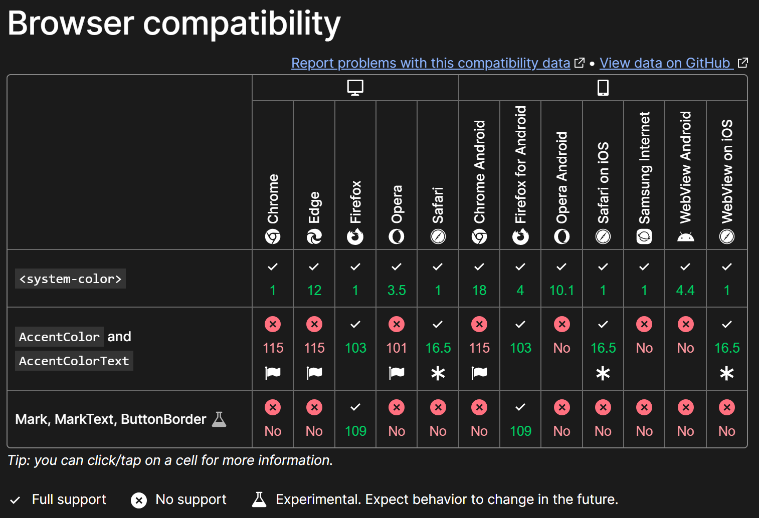
AccentColor (and AccentColorText) are called out as not supported in many browsers in comparison to the rest of the list. What’s up with that? The answer: Privacy.
Fingerprinting
The introduction of AccentColor into browsers begins here in 2022 and everything is going fairly smoothly until August 2023, where Joey Arhar, a engineer working on the Chrome browser for Google, leaves a comment suggesting that implementing this feature could present a new “fingerprinting” vector. This spawns a totally new and separate discussion about Mitigating fingerprinting for AccentColor/AccentColorText bringing the original discussion to a halt over these concerns.
So what’s all of this about fingerprinting? Here’s what web.dev says:
Fingerprinting means trying to identify a user when they return to your website, or identifying the same user across different websites.
The idea is that identifying the color assigned to AccentColor for your device could be a data point in a larger collection that would specifically identify you (or more specifically your device) such that scripts could follow you from site to site. You might see how this could be used from an analytics point-of-view, where you could follow the path of a user from an advertisement all the way to a purchase flow. However, this could also be used in a digital surveillence capacity. Scripts could collect data about a target’s device and then identify how that device travels between collaborative or infected sites.
This is the reason some of the properties that were once introduced at window.navigator are now marked as deprecated. It is because they offered too much information that could be used for fingerprinting. If your code is depending on the type of browser or device, it’s possible this is no longer reliable. Instead, you should modify your code to use feature detection instead.
Importantly, the real problem isn’t the color but the value that the color represents. There’s no problem with displaying the color to the user. The problem arises when some code attempts to read the value of the given color which could be used as a data point. That’s why the newer discussion considers returning static values for when the color is meant to be retrieved, such as using getComputedStyle() in JavaScript or if the color was to be rasterized to an HTML <canvas/>.
What isn’t clear yet is how the keyword might work with CSS color-mix() and this is why I’m heavily interested in the outcome.
Personalization
In my most recent work, I speak about the concept of influence. This means instead of an organization curating tokens precisely, I recommend looking into the idea of influencing existing values with some brand expression. In this way, we don’t specifically say that $body-bg is exactly #ffffff but instead we influence the given color with ours by some amount. What is the given color? In my opinion, it’s the color chosen by the user. How it is chosen can be a separate topic altogether but consider this; imagine if we could support light and dark mode simply by saying “#66ff22 is our brand color” and let the system figure out the rest.
Here’s a practical example: let’s say I’m trying to convey the brand of Home Depot with their signature orange #ee7125. Instead of going through all of the tokens, for both light and dark mode, what if instead I only provide this one color and let modern color functions and system colors fill in the rest?
body {
    /* Set our brand color */
    --brand-color: #ee7125;

    /* This is needed for system colors to work */
    color-scheme: light dark;

    /* Use color-mix to influence the system color */
    background: color-mix(in oklch, Canvas, var(--brand-color) 5%);
    color: color-mix(in oklch, CanvasText, var(--brand-color) 5%);
}
This would tint the background and foreground colors with the --brand-color by 5%. Importantly, the color supplied by Canvas and CanvasText is supplied by the device and browser depending on the user’s settings. As an example, in light mode, we’d expect Canvas to be a light color. Importantly, you cannot be sure what this color keyword is exactly. As a reiteration, this means we aren’t choosing the color for the background and foreground directly, but we are influencing what is given by the user’s choices with our own orange brand.
Ultimately, I’d like to see system colors that were closer to the concept of intents. Though I’ve found some sensible replacements in most cases. You can see some of this in action at my system playground.
There’s lots of opporunity for this to fail unfortunately but I believe there’s also opportunity for this to succeed. A user can be responsible for the appropriate general presentation either actively (heyo hot dog stand 🌭) or passively (maybe learning user activity). While we influence that presentation slightly with our own branding. This needs more experts, especially ones who work with color, to figure out best practices over time.
Folks that are used to providing highly curated values for their experiences are going to feel uneasy with this. But for those who truly put the user first, we can lessen the emphasis on choosing color and redirect our efforts to providing a better overall experience.