
It’s unfortunate that the first entry at the Laws of UX is the “Aesthetic-Usability Effect” which is summarized with the following statement.
— Jon Yablonski, Laws of UXUsers often perceive aesthetically pleasing design as design that’s more usable.
The source for this law is from an NN/G article which I find does a much better job summarizing the concept.
— Kate Moran, Nielsen Norman GroupUsers are more tolerant of minor usability issues when they find an interface visually appealing. This aesthetic-usability effect can mask UI problems and can prevent issue discovery during usability testing.
The difference between the two statments is that the former suggests that its good to hide usability problems with garnish. The latter addresses that this is a problem when measuring success accurately. I believe that color is part of that avoidable garnish.
Full transparency
I’m color deficient. You might have heard of this as color-blindness however, I am not blind to color. I do not see the world in only black & white. I can see colors, just not as well compared to most people. I can appreciate a good synthwave hot pink most of the time. However I also don’t believe that the world should be black & white. Color provides personality and identity. There’s emotion behind each selection and often relates to an opinion of a piece looking attractive or replusive. It is clearly a driver of some decisions but hardly ones that direct a critical path of usability.
Art is not design
Art is a freedom of an artist’s expression; an attempt to convey a feeling through their medium. It is commonly an egocentric activity to achieve a desired appearance. This is in contrast to design which is striving for altruism and inclusivity. This is supported through pattern recognition and reusing familiar experiences to achieve a goal. Design systems are the ultimate solution for achieving this cohesive experience; establishing trust between the user and the product. One deviation from past experience could be enough for the user to hesitate on the next step or stop the progress indefinitely.
In design, form follows function. It means that something should be usable before it is beautiful. In order to do this, we must identify the problem we need to solve. In a qualified user experience practice, this will not begin with designing an interface but with research. Interviews, competitive analysis, user personas, and all the truth finding techniques to paint the best picture of the problem so that you can begin to hypothesize a solution.
Wirecutting
After completing a phase of user research, the next task is not jumping into high-fidelity, pixel-perfect mockups. I’ll coin the term “wirecutting” for when a designer cuts out this wireframing step to work on prettier things. Wireframing helps visualize the flow and features expected to support the user’s goals. In this process, it is easy to see when cluttered interfaces appear and the priority of elements reevalutated. These are commonly without color and for good reason. If it doesn’t work in black & white, color isn’t going to help. Putting gold leaf on a turd, is a really shiny turd.
I believe in a world where wireframes are piped into a tool which creates high-fidelity mockups using the rules and guidance of a design system. Amazingly, this world is here in the form of Uizard. Using this tool, designers can avoid the nuiances of following the system guidelines and focus on the experience by wireframing. The tool should handle the high-fidelity part of the handoff process. For some folks, this may take some of the fun out of the job. On the other hand, maybe the job was misunderstood in the first place.
Of course this assumes a design system is well established. So let’s now focus specifically in this area.
Budget crayon box
There’s dozens of posts online about how color palettes were created for a design system (Lyft, Github, Adobe). A great deal of talk about color theory and creating tools to help visualize curves of color for the perfect balance. I cannot deny that resulting palettes are often very beautiful and I often need to use the work of others in order to choose color due to my deficiency. However, how much of that palette do you really expect to use? This is the palette created by Ferdy Christant based on Open Color.
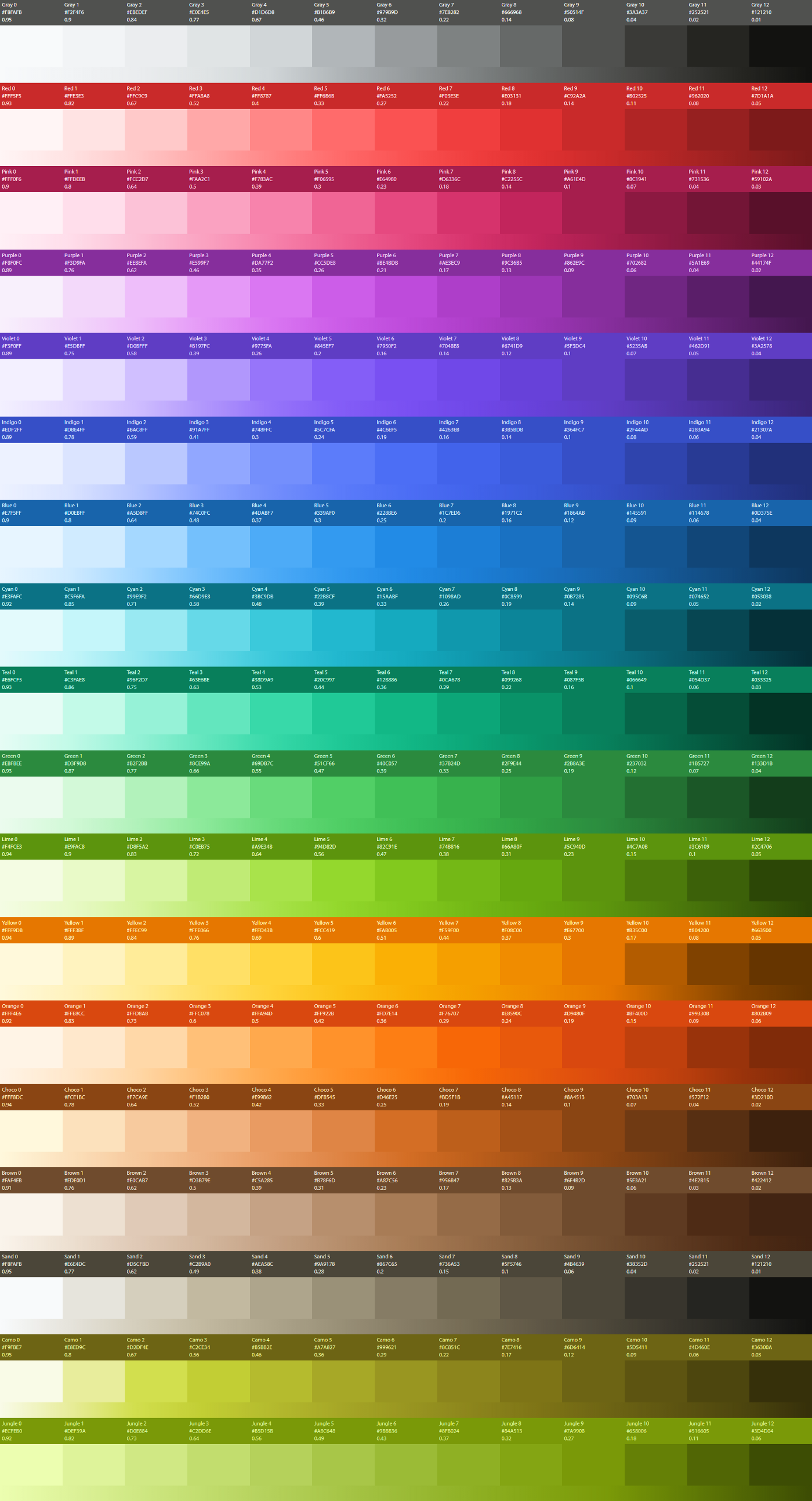
That’s a lot of color.
Let’s first just talk about contrast which is a requirement to make something accessible. If you have several steps of color, I’d guess that many of the colors found within the middle of those steps have trouble being accessible with most colors in your palette. This is something that the Stripe team found while revisiting color for accessibility. It’s very possible you could omit much from the middle of the palette to support accessible color choice.
And in Ferdy’s post about working with the palette, there is mention about the lack of accessibility in the palette.
— Ferdy ChristantOpen Color does not rank well when it comes to contrast. The root cause here is that we’re paying the price of beauty.
You’ll be paying for more than beauty if hit with an accessibility lawsuit. But Ferdy’s answer is to add more color; 3 more dark tones to each hue. I don’t agree with this suggestion because trying to choose the right color becomes a challenge when there are so many to choose from (ie., Hick’s Law). Limiting the selection drives consistency. I’ll even go so far to say that it enhances creativity because you’ll need to design within constraints which requires out-of-the-(crayon)-box thinking.
Coloring outside the lines
Past contrast, let’s now talk about the application of color within an interface. If you look at many modern interface designs today, they tend to follow a 60/30/10 rule. Some sites like Twitter even let you choose a few colors. This comes from interior design where you choose 3 colors and use them in percentages in your space. This is a loose rule, and opponents of the rule will call out several factors against it.
— Catherine RasgaitisFirst, restricting a color palette to only three colors inhibits creative designs. While it prevents overstimulation, exploring more “rebellious” designs make brands stand out from their competitors.
For the purpose of functional product design, I don’t believe we should be striving for creativity in the application of color. Users are expecting familiar and accessible experiences. Painting with all of the colors of the wind will feel like navigating a rainbow hurricane. The limiting of this color helps set expectations as users achieve their goals.
Even in interior design, the original birth of the rule, it is near impossible to strictly use only three colors. It isn’t realistic. There will be additional hints of other colors outside the chosen selection for elements that make up a room. This is a photo of an actual room in the design systems house.
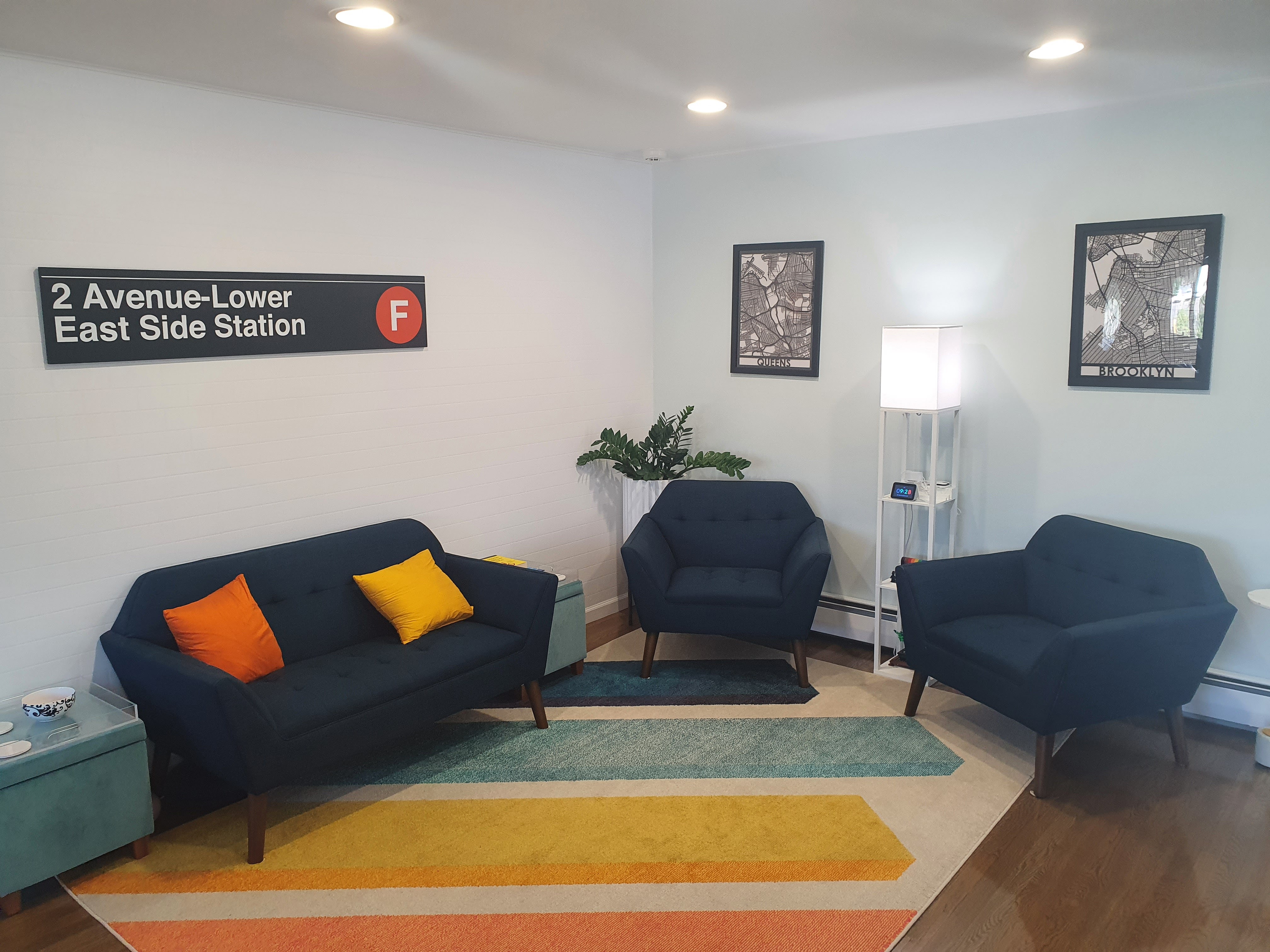
White is a majority, blue is next most prominent, accents are orange-yellow. Importantly there are other colors too! The green plant, the teal footstools, even a rainbow legoset. Admittedly, the rule should probably be something like 55/25/15, which leaves an additional 5% of various colors not covered by the rule where applicable. For user interface design the majority of color will cover the background, the next most important color covers content, and the final most important covers accents that draw the user toward interactivity.
So for most cases I believe you could probably design the large majority of an interface by having a palette of roughly 10 colors or less.
Cases for more crayons
An area where more colors are typically introduced are parts of an experience that are meant to indicate status. An error state is frequently shown in red. However, if the text describing the error is too small or thin to distinguish color, it could be missed as an error. Furthermore, the color red is prosperous in China. These are all reasons why we should not rely on color alone to indicate status. I recommend having two forms of status indication; one can be color where cultural sensitivity is considered and then some other pattern to support the status.
Another area where color is used is to indicate deviations between near identical entities. This can commonly be found in elements like data visualizations (ie., charts) but can also be found when segregating users in a list of contacts. Changes of color here are meant to separate like items making the collection easier to scan.
I can tell you from experience that I often have difficulty identifying the parts of a data visualization that relies on color to show data but don’t take my word for it. You can imagine how much harder it would be for a blind user to experience. This is again why more emphasis should be given toward presenting the data inclusively, perhaps using a table, and also include a progressive enhancement through a visualization. Putting the color before the data is only helpful for some; let’s consider being help for all. The Carbon folks at IBM have more tips to support data visualization for accessibility and mention more work still needs to be done.
Finish with color
There is a reason why, when you apply stain to a table, the solution you apply is called the “finish”. It happens at the end of the building process. After all the plans are made, the legs cut and fastened, and the top made smooth do you finally apply the coloring. Color can bring the personality to an experience and to call something done. There can be an appropriate time to focus on this work but for the start, keep it simple and use design tokens to support changes for the future. Make color the finish to a usable product.