I’ve been writing CSS for a long time and it’s really exciting to see the fast improvements to the language that we’ve received over that time. In this post, I’ll demonstrate two ideas that I always wanted to do natively with CSS alone.
First, a warm-up before we get to the wild stuff.
Grid centered line-height
I know of plenty of designers who want to maintain a vertical rhythm for all content on the page. They’ll painstakingly adjust border widths and line-heights to ensure all of the little elements on the page align to some vertical grid such that there’s a rhythm to reading downward.
As the person who wrote Gridless Design, you can imagine how I feel about this. In my opinion, the time spent trying to get this alignment would be more worthwhile on other things; say… improving the user experience as an example. However, now that we have some new CSS in browsers, getting the vertical rhythm to align with your grid can happen at any font size very easily.
We’re going to need a bit of math for this. Let’s say that you have an 8px grid. This means elements on your composition should be sized in multiples of 8px. Let’s also say that your line-height for paragraphs should be 1.4, meaning the resulting height of each line should be 1.4 times the size of the font so the space between lines helps readability. If your paragraph font is 18px, this means the paragraph line-height would result in each line of text being 25.2px high.
Clearly, this doesn’t align to our 8px grid. Historically, we’d curate the line-height each time we introduce a new font-size. In this case, we have to hardcode the line-height knowing the font-size such that it remains on the 8px grid.
.paragraph {
    font-size: 18px;
    line-height: var(--paragraph-lineheight);
}
Rounding to the nearest grid
In order to determine the correct number here, we’ll need to round 25.2 to the nearest 8. Doing this in JavaScript would look like this, assuming the numbers are entered without units:
function lineHeight(fontSize = 18, lhTarget = 1.4, gridUnit = 8) {
    return Math.ceil((fontSize * lhTarget) / gridUnit) * gridUnit;
}
The messy part is rounding to the nearest grid unit. We have to divide 25.2 by 8, then round that to the nearest integer and then multiply by 8 to get 32. This means that the --paragraph-lineheight should be set as 32px when the font size is 18px and the target line height is 1.4.
As you can see, this is very cumbersome. We’d need to know the exact font-size value, the grid unit, and the target line-height for this kind of element to determine the final result.
Luckily, the new round() CSS function can really help us out.
.paragraph {
    line-height: round(up, 1.4em, var(--grid-unit, 8px));
}
This is effectively the same calculation that was demonstrated earlier in JavaScript. The round() function is fairly well supported and can take three arguments:
- The first can determine the rounding strategy, in this case we want to round up in the same way we used
Math.ceil()before. - The next argument is the number we’re going to be rounding. This will represent the target
line-height; basically the minimumline-heightallowed. Unfortunately, we can’t use the unitlessline-heighthere but we can use theemversion instead which would result in the same final pixel amount. - Finally, the amount to round by. This part of the function is awesome. It avoids all of the weird division and multiplication to round by an amount in the JavaScript. Here, we want to round to the nearest grid unit. In this example, I simply set the default as
8pxin the second argument of thevar(), and then it can accept any update in the page and fallback to8px. You can also use any value with units here instead.
You’ll also notice I’m not explicitly setting the font-size here. This is because this line-height value will respect whatever font-size this element is because it’s referencing em units, even if it is inherited from a parent! If your target line-height is meant to be tighter, as is normally the case for headings, you can adjust the target to be smaller like 1.2em.
.heading {
    line-height: round(up, 1.2em, var(--grid-unit, 8px));
}
Here is a codepen demonstrating the technique. The gray lines behind the text represent the grid unit intervals and the red background on the text shows how much space the text takes up. You’ll see that the gray lines will never be cut-off at the bottom of the container because the line-height for this element is always on grid. The span is not important to the CSS, it’s there just to visualize the height of the text.
Ok, that was a good warm-up. Now it’s time to get wild!
Dynamic letter-spacing
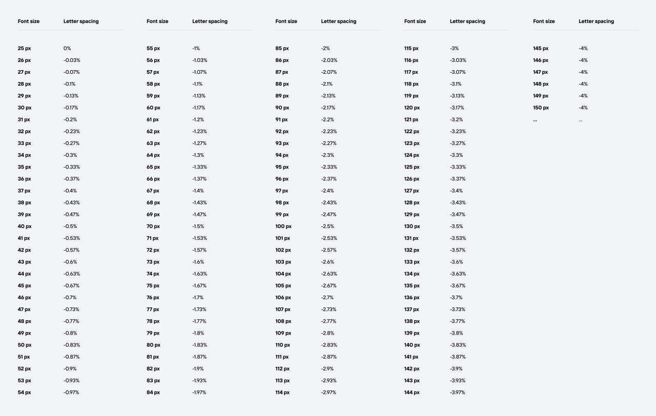
Like line-height, I always felt that tweaking the letter-spacing was a waste of time. Especially as more custom fonts become normal, I felt setting the letter-spacing should be embedded in the font file itself. However, I saw a post by Mathieu Badimon, formerly leading efforts for the design system at Adobe, sharing a way to do this dynamically. The gist is that he’s developed a scale where the letter-spacing of the text will get tighter as the font-size increases. Immediately, I wanted to try to do this in CSS alone. This took much longer than I hoped.
The easy parts
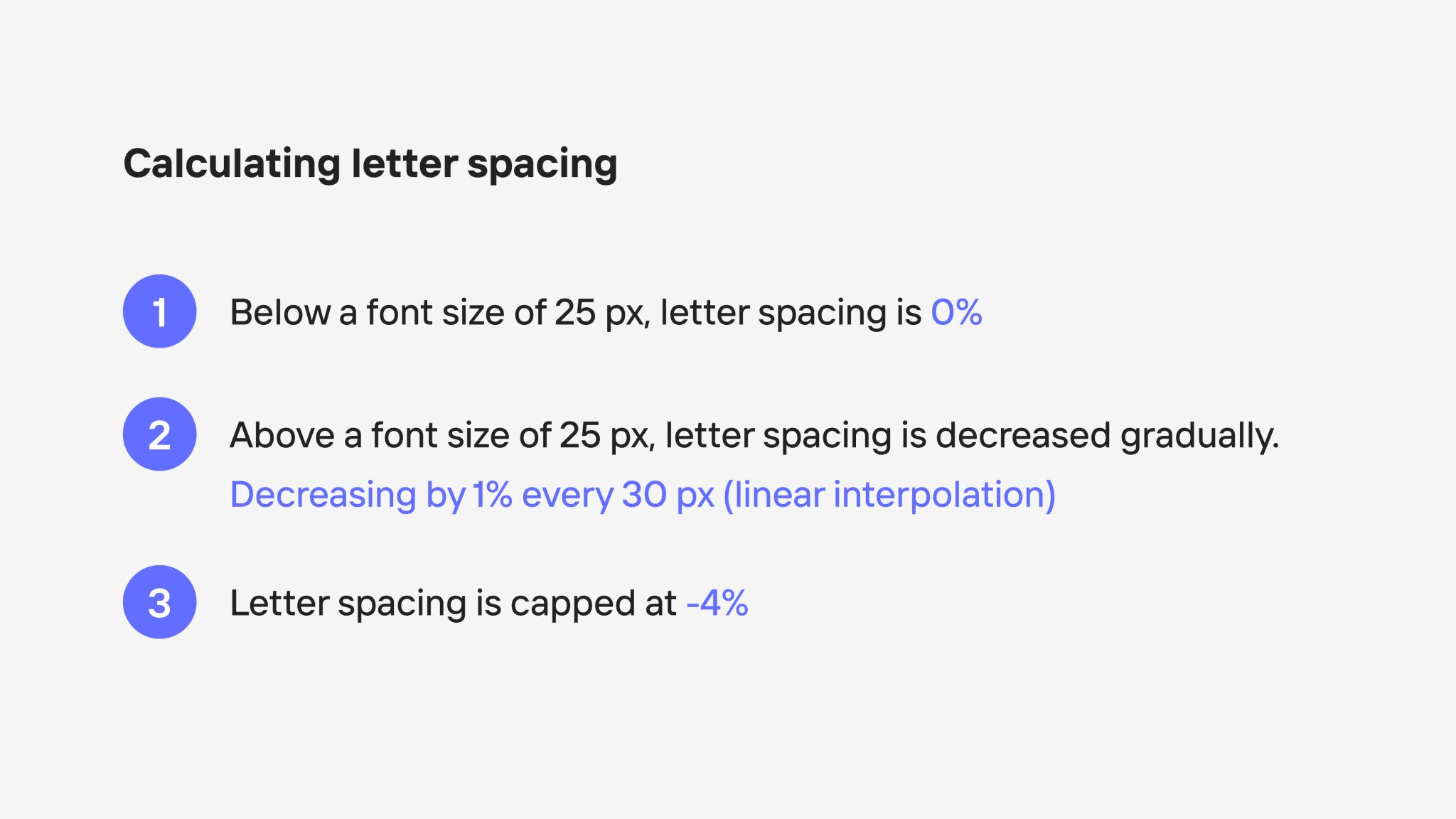
The first thing is that there is an upper and lower limit. This is pretty easy in CSS today using the clamp() function. So we’ll start with that using the values he recommends in the post; Sizes 25px and below should be 0 and -4% for sizes above about 145px. Since, letter-spacing doesn’t accept % units, we’ll use em instead which can be thought of as a percent of the font-size. Remember that the lowest value goes first, that’s why -0.04em is first and 0em is last.
.paragraph {
    letter-spacing: clamp(
        -0.04em,
        var(--ems) * 1em,
        0em
    );
}
Ok, so far so good. Now all we need is the rate of change. You’ll see that there’s a graph included in his post, but he mentions that the graph is actually inaccurate. That’s fine, we’re going to use the numbers he provided later in a comment.

What we want is the rate of change between to points, this can be thought of as finding the slope of a line between points. If we think of the font-size as the y and the resulting percent as x, we can find the slope (m) in the following way:
Plugging in some numbers from the chart, we get the following:
This shouldn’t be a surprise from Mathieu’s post:

The -30 is related to the 30px every 1% decrease. The next thing we need is the formula that produces all of the x values based on a given y. You might remember this formula from school:
However, we want to solve for x, so we need to rearrange the terms:
In this formula, y is our font-size, and m is the slope we got earlier of -30. So what does b represent? It’s where the slope crosses the x-axis. We could find this by moving terms around again, but Mathieu has already provided this number; 25 (for 25px where this calculation starts). Our formula now looks like this:
This doesn’t look too intimidating yet, but here’s where it get challenging. We need to turn this into CSS. Let’s try just making some variables for this first:
.paragraph {
    --b: 25px; /** starting size */
    --m: -30; /** rate of change */
    --x: calc(1em - var(--b)) / var(--m)); /** percent? */
    letter-spacing: clamp(
        -0.04em,
        var(--ems) * 1em,
        0em
    );
}
Ok, so far all of this should work. We’re still missing the --ems assignment but we can subtract unit values from each other, and we can divide a unit number by an unitless number. When we subtract units like this, the result is resolved into a pixel amount. This’ll be important later.
The hard parts
The first problem is that --x isn’t a unitless value, it’s a pixel amount. Setting this as the --ems isn’t correct because in Mathieu’s formula, we want a percent of the 1em. So we want --x to have the pixel units removed.
There’s a recent trick made popular by Jane Ori which demonstrates how we might hack CSS to give us unitless values using atan2(). We’ll need to add a few things:
@property --x {
  syntax: "<length>";
  initial-value: 0px;
  inherits: false;
}

.paragraph {
    --b: 25px; /** starting size */
    --m: -30; /** rate of change */
    --x: calc(1em - var(--b)) / var(--m)); /** percent? */
    letter-spacing: clamp(
        -0.04em,
        var(--ems) * 1em,
        0em
    );
}
The first thing we need is to effectively force the --x to give us a pixel amount. It might seem weird that we need to do this since we know it’s resolving as a pixel, but it’ll be important so we can use atan2().
@property --x {
  syntax: "<length>";
  initial-value: 0px;
  inherits: false;
}

.paragraph {
    --b: 25px; /** starting size */
    --m: -30; /** rate of change */
    --x: calc(1em - var(--b)) / var(--m)); /** percent? */
    --ems: tan(atan2(var(--x), 16px); /** percent! */
    letter-spacing: clamp(
        -0.04em,
        var(--ems) * 1em,
        0em
    );
}
You’ll see I’ve added the --ems variable by using the approach in the blog post. You can essentially look at this as returning --x in terms of 16px and return the unitless result. What we have will work, but there’s one small problem. I’ve explicitly set 16px here which is assuming base font size as a fixed pixel amount. Entering 1rem in here doesn’t work (and admittedly I’m not entirely sure why even when updating the @property defaults).
What we’ll need is 1rem in terms of pixels. Luckily, Jane has that example in her post. We’ll use another atan2() to get the unitless number of pixels per rem (16) and expect to replace the 16px with this result. This actually needs a number with a pixel unit so we can do that quickly by multiplying the unitless result of the new atan2() by 1px to finally resolve to 16px. Here’s the whole working declaration, followed by the codepen:
@property --x {
  syntax: "<length>";
  initial-value: 0px;
  inherits: false;
}

@property --rem {
  syntax: "<length>";
  initial-value: 0px;
  inherits: false;
}

.paragraph {
    --rem: 1rem;
    --b: 25px; /** starting size */
    --m: -30; /** rate of change */
    --x: calc(1em - var(--b)) / var(--m)); /** percent? */
    --ems: tan(atan2(
        var(--x),
        calc(tan(atan2(var(--rem), 1px))) * 1px)
    ); /** percent! */
    letter-spacing: clamp(
        -0.04em,
        var(--ems) * 1em,
        0em
    );
}
I do wonder if there’s a setup that allows us to remove the second atan2() usage and insert the 1rem directly here but I haven’t found it yet.
Whew, what a ride! Maybe one day, we’ll get a supported way of dividing values with units to return a unitless value. But for now, we can wish upon this proof-of-concept. Thanks to Mathieu and Jane for their resources!

