
In the most recent Wireframe live show, Dan Abramov came on to talk about his excitement over the new AT Protocol. The AT Protocol is a new web standard that allows for decentralized social networking. It is designed to be more inclusive and accessible than existing social media platforms.
Before the chat, I only really knew the protocol as the layer informing Bluesky. I tried learning more about it when trying to integrate the new standard.site features for publications like this one. The standard.site integration results in an enhanced post on Bluesky when done properly. Except when I was looking at the docs, I was immediately overwhelmed by the perceived complexity of the integration. I was hoping it would just be a metatag to add to my site. There’s more involved, and admittedly I won’t know if it worked until I share this very post. Do it live!
However, after that chat with Dan, I was inspired to go deeper. The way he puts it, this is trying to take back the web to what it used to be, people just sharing stuff they like. The one thing that stuck with me was that he said it’s like RSS. I love RSS. The first full-stack application I ever built, deltazeus, was centered around RSS. I love being able to subscribe to content, have it aggregated, and the best part have it presented in the way I want to see it.
Toward the end of the show, I mentioned that I could see something in this new world that helps standardize the way we theme our applications. As many folks know, I’ve spent a lot of time thinking about how theming could be solved once and for all so anyone could express themselves. Understanding the essence of the new protocol as a way to share data helped me make the connection that a theme is data. So, why not share this too?
A new standard
Last week, I started working on a new standard for theming based on my Mise en Mode approach. If you want to just dive right in, there’s a small documentation site at standard.mode.place and a repository for the lexicon at tangled (the atproto alternative to GitHub). In this post, I’m going to explain some of the details of what I’ve put together and why I think this is a good approach to theming.
App, author, viewer
In the standard I declare three different roles: the app, authors, and the viewer. The app is the owner of a default look of the application. For example, if this was Bluesky, when a person visited the site, they’d see the Bluesky branding decisions on the site. The colors, typography, and other design decisions made by the Bluesky team. Nothing too groundbreaking yet. The small difference here is that the variables used to define the look of the app are standardized under this approach.
If you’re unfamiliar with Mise en Mode, you can first think of having variables that represent the purpose of something in the UI. It’s closest to system colors such as CanvasText or ButtonFace. There’s a whole construction behind the variable names chosen here, and it’s taken several years to develop. If you’re familiar with design tokens, this’ll be very familiar. Mise en Mode uses design tokens but it is not just the tokens, it is the way we use those tokens to express a look in regions within an experience.
That’s the next part, just like how standard.site allows a small theme object to define how their publication might look elsewhere, this new standard gives the same functionality with a few more knobs to control other elements that might appear over time. A publication author could create their own theme, and then the site adopting this new standard could choose to display the author’s theme in scoped areas of the experience where it is appropriate. In this way, there’s not much difference from what you might be seeing on Bluesky today. You’d see publications that adopt this with their own colors in the “view publication” button.
The last part is where this really gets interesting. The viewer is an authenticated user with their own defined theme. When an application that adopts the standard is visited, the viewer’s theme is applied to the experience. This means that if a viewer has a preference for a dark mode, or a high contrast mode, or any other theme they might have defined, it will be applied to the experience. This is where the power of this standard really shines. It allows for a more inclusive and accessible web experience, where users can define their own preferences and have them respected across different applications.
Scoped themes
Just like how standard.site scopes the look of the publication to a part of the Bluesky feed, think about how you might want to do that for any region. Maybe you have a music player and want the artist’s theme to be shown when the music is playing without affecting the rest of the website. For e-commerce, perhaps the brands’ products have their theme shown to support recognition. These are all decisions that the app can make about how it wants to present itself and the content. It could just as well choose not to have these things change while still adopting the standard to allow theming.
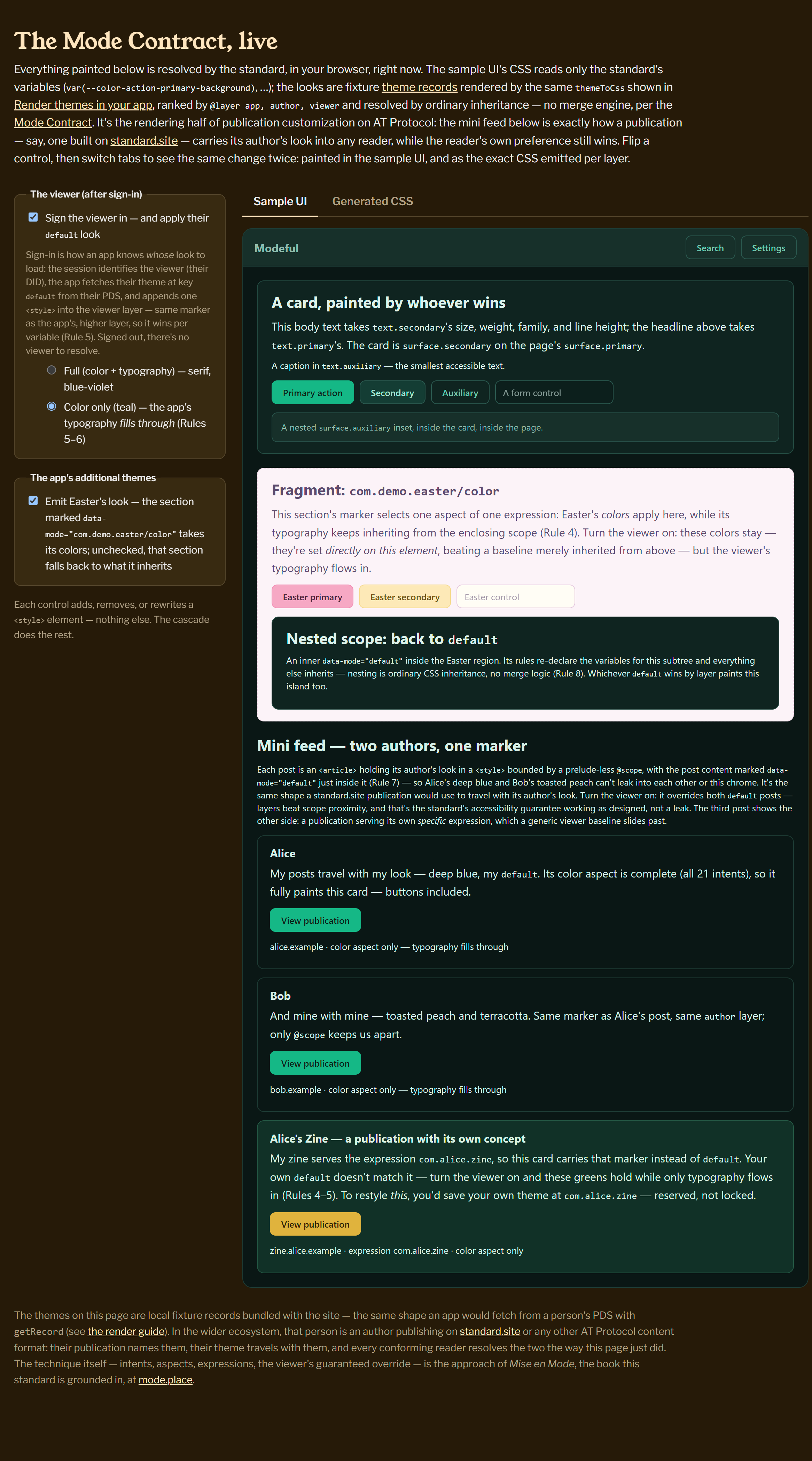
If you want to see how this might work in a webpage, I have a demo you can try out. It shows how different regions might be affected depending on how the app is configured and what is applied to those regions. In some cases, the app decides only color should be updated, while the typography falls through from the higher scopes. This could allow for some combinations where you still want the site to have consistency but also allow visitors to have their own accessible (or just fun) color combinations.
Small footprint, big impact
Mise en Mode suggests that you only need 33 variables to express nearly any look. This means that the amount of curation that a person needs to create their own look is small. While I do know this doesn’t cover all areas of applications (for example, it does not cover data visualizations), it does cover the majority of the experience. I have plans to extend the standard as needed, but I think this is a good starting point. It’ll cover what standard.site is doing right now and leave plenty of room to play with other looks.
Right now, I’m looking for feedback on the standard from the community. I’ve made a post on the ATProtocol Community forums about this work. Importantly, I haven’t published v1 of the protocol yet, so this is all theoretical at the moment. The PR with the lexicon is here. If you’re in the thick of atproto right now, I’d love to hear your thoughts. Even if you aren’t but want to know how theming might support your experience, you’re welcome to join in the discussions.
I’d also like to build out the docs site to be a UI that helps people create their own themes easily. The goal is to make it as easy as possible for anyone to express themselves and have their preferences respected across different applications. This is a big step towards a more inclusive and accessible web, and I’m excited to see how it evolves over time.