This weekend a project called pretext started making waves by Cheng Lou. Here’s a gif that has been blowing up social media:
There’s no doubt about how impressive this demo is. The speed in which the text moves out of the way of the dragon is pretty incredible. As expected, many people are saying this is the end of CSS. So, let’s talk about it and address the demos provided that showcase some of the features in the lens of user experience.
Accordion
The first demo is of an accordion showcasing how the sections open and close smoothly without CSS hacks or measuring the DOM. This has been true for many years, we’ve wanted to animate from an intrinsic height for a long time. Well, we can do that now with pure CSS, in a few different ways.
The first way was maybe a hack, which was to animate the grid row. This was discovered 5 years ago. The difficulty with this approach is that it doesn’t work well with the native <details> element.
The second way is to use interpolate-size: allow-keywords. This allows you to animate between a <length-percentage> value and an intrinsic size, fit-content, or max-content. This allows you to animate between 0 and auto for the height.
And finally, we have calc-size() which is a function I recently used on the new Mise en Mode website to get the auto size as a number that can be used in other functions, such as round(). This also calculates the intrinsic size of the content, so it can be used to animate from 0 to auto as well.
As you might see when reviewing the MDN pages of these new CSS features, they don’t all have baseline availability yet. But do you really need JavaScript in order to animate the accordion? I’d argue you don’t, if you’re willing to put in a little extra effort learning what CSS has, and not ship some extra JavaScript for the sake of this.
Bubbles
This is an interesting one. This is showcasing something called the “shrinkwrap” problem that is now more common than ever in a world of web chats. The problem is that CSS text wrapping isn’t efficient. The bubble that it leaves will have extra space not taken by text. What would be preferred is for the bubble to only be as big as the text needs to be. So without the shrinkwrap, each bubble is the same width. Meanwhile, with shrinkwrap, the bubbles match the size of the text leaving no extra space.
![]()
There is a CSS solution found by Roman Komarov to help with this problem which uses the new anchor positioning features. It also uses some pseudo element tricks to get the effect to behave. This is a pretty clever solution, but it is also pretty complex. It also doesn’t work in all browsers yet.
The question is, do you want to bring in a JavaScript library just to get your text bubbles to shrinkwrap? Is this going to improve the user experience or is it an attention to detail that is not worth the cost of the extra JavaScript? I would argue the latter. The shrinkwrap problem is a problem, but it’s not a problem that is worth the cost of bringing in a JavaScript library to solve it. It’s a nice to have, but it’s not a must have.
Dynamic Layout
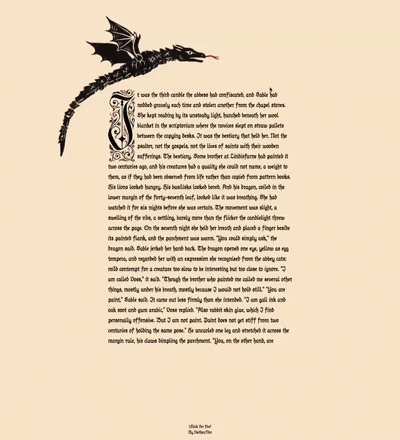
This looks like a magazine or editorial layout which has some images that are effecting the placement of the text. When I first saw this, I immediately thought of the shape-outside property which allows you to wrap text around a shape. Honestly, I haven’t used this CSS property much but I do know it takes some setup in order for it to work. You’d need to have an alpha of the shape so that text can wrap around it. The object needs to be set as a float in order for the wrapping to occur. Placing that element could be a pain, requiring additional margins to be added, most likely with shape-margin.
What CSS won’t accomplish is the rotation of the images. For example, setting rotate: 45deg on the image doesn’t affect the text wrapping around it. In the pretext demo, rotating does affect the text. Ultimately, I imagine you could maybe animate a very complex polygon of points to follow on an interaction. But the reality here is that if you want this effect, JavaScript is the way to go.
But do you want this effect?
Even without the animation, when text doesn’t consistently start at the same place, it can become tiring to read. This is why we don’t typically center body text. Our eye wants to align to the left (or right in RTL languages) and when it can’t, it can be a bit of a strain. The additional rotation that can occur would make catching the word you were trying to read difficult since all the lines are recalculating their position on every frame. This is a fun effect, but it’s not something that I would add to an article because it’ll distract from the content and make it harder to read.
Variable Typographic ASCII
As you might imagine, this isn’t meant for you to read the text. This is instead a artistic effect that uses glyphs to create a visual piece of art. Since there isn’t anything here that is specifically UX related, I’ll refrain from commenting on it, past hoping that someone puts an aria-hidden="true" on it so that screen readers don’t try to read that unintelligible mess.
Editorial Engine
Similar to the dynamic layout, this is a layout that has some images that are effecting the placement of the text. The difficulty in reading the text is much more apparent here because the balls are constantly moving around making the location of every word change on every frame. As said earlier, not something I’d use for something I’d want someone to read.
Justification Comparison
I have to admit this has some practical use. The justification algorithm in CSS leaves a lot to be desired. It doesn’t do a good job of balancing the space between words and letters, which leads to large gaps appearing within the text called rivers. The pretext demos show a better way of balancing the text such that the rivers are reduced, even having tighter algorithms available.
Though, one thing you’ll need to be careful of is the introduction of hyphenation. CSS has a hyphens property that allows you to loosely control when words are hyphenated. If you have a better justification algorithm, you might find that you need to hyphenate more often in order to get the best results. This is something to keep in mind when considering this approach as I did when typesetting the book Mise en Mode and ultimately decided to avoid justifying the text because of the potential for rivers and the need for hyphenation. I wanted to avoid both of those things in order to provide the best reading experience possible. I kept the content as the primary focus in a way that was familiar without stressing over the details of justification. Curating every small hyphen is very tedious. I personally rather keep the words intact and not have full justification.
Rich Text
Again, I think this does have some practical use. I’ve recently written about the difficulty in wrapping inline code accurately in CSS. In this demo, the inline code does wrap in a reasonable way but I’ll also say there’s configurations that make the wrapping a bit too eager.
It might make some sense to add some <wbr> spaces into the code at the right places. This could be done in a preprocessing step instead of on the client where the pretext project needs to run.
Masonry
Ah yes, the layout everyone is waiting for. While display: grid-lanes isn’t the property value we might have been expecting, the industry has been asking for a masonry layout for a long time. The pretext demo shows how to achieve this layout with JavaScript.
While we’ve known that we’ve needed JavaScript to have dynamic masonry layouts for a long time, there’s something you need to consider when implementing them; reading order.
When you look at a masonry layout, what is the order of the boxes meant to be read in? Is it top to bottom, left to right? Or is it left to right, top to bottom? Maybe it changes due to one box being longer than another. If you inspect the demo you’ll see that some of the items are inserted in places that aren’t in any clear order. It is most likely using a dense packing algorithm to efficiently use the available space, but this isn’t necessarily how the items are meant to be consumed.
The new reading-flow property in CSS is meant to help suggest how these items are meant to be read. I’ll say with the amount of consideration the CSSWG has put into display: grid-lanes, I’d trust that they’ve thought more about how masonry layouts should be managed more than “whatever fits best”.
What is pretext for?
It’s for people who want more control over how text flows; either for artistic purposes or for typesetting designers who crave the tools traditional print design has had for a long time. Just remember the web is not print. Text has never animated on a magazine page, nor has that magazine page needed to download additional code in order for the layout to behave. These are different mediums even if we’ve made analogs to them over the years.
I’m certainly not saying to avoid using the library, I think it’s fun and does have some practical use cases. But you should first consider your users and whether the features of this library are worth the cost of the extra JavaScript and the potential decrease in user experience. If you do decide to use it, make sure to use it in a way that enhances the content and doesn’t distract from it.
This certainly isn’t the end of CSS, it’s showing what’s next.