
I got into an argument on LinkedIn this week about design choices. Very on brand for me. It started with this image:
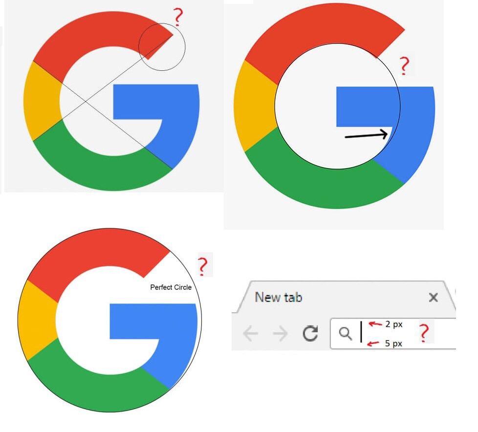
The post was defending the choices made in the image, and went on to say that people who aren’t designers have no business questioning these decisions. The weird part about it was that this person wasn’t a designer according to their profile. Since they’ve blocked me from rebutting I can’t link to the post, but I want to take the opportunity to explain that I understand why the logo is not truly a circle, but I’m less convinced about the bar in the field.
The fallacy of optical alignment
Much of my research is uncovering why we make design decisions. This makes the decision repeatable by following some set of rules for when a new but understood pattern emerges. When it comes to optical alignment, there’s a large collection of articles made by designers who will explain that some shapes shouldn’t be mathematically centered, and instead should be “nudged” to make them look centered to the eye. I’ll be referencing some of the images from the very first post at the top of my search results for “optical alignment ui”.
This is what we have typically called “optical centering”. And the post above even includes the word “eyeballing”. Here’s an example from the post but is also found in many similar articles:
When we measure the sides of the icon in the middle, they don’t match. However, the icon looks like its centered in the middle of the container. Is this just how our eyes work? Are our eyes imperfect? No, you are still centering the icon. It’s just using a different center. In fact, the triangle is a great example of a shape that has lots of centers. Here’s an image from another post, which demonstrates how this would work in a circular container:
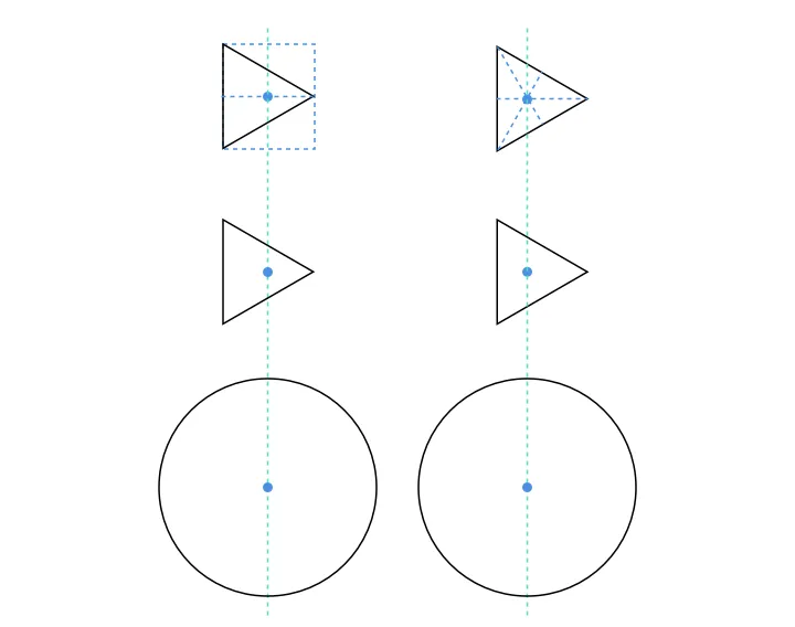
The post where that image is from also shows that the technique being described doesn’t necessarily work for all icons. All icons are not squares or triangles so how are we suppose to think of this? Let’s look at another example which is linked to optical alignment.
Area not dimension
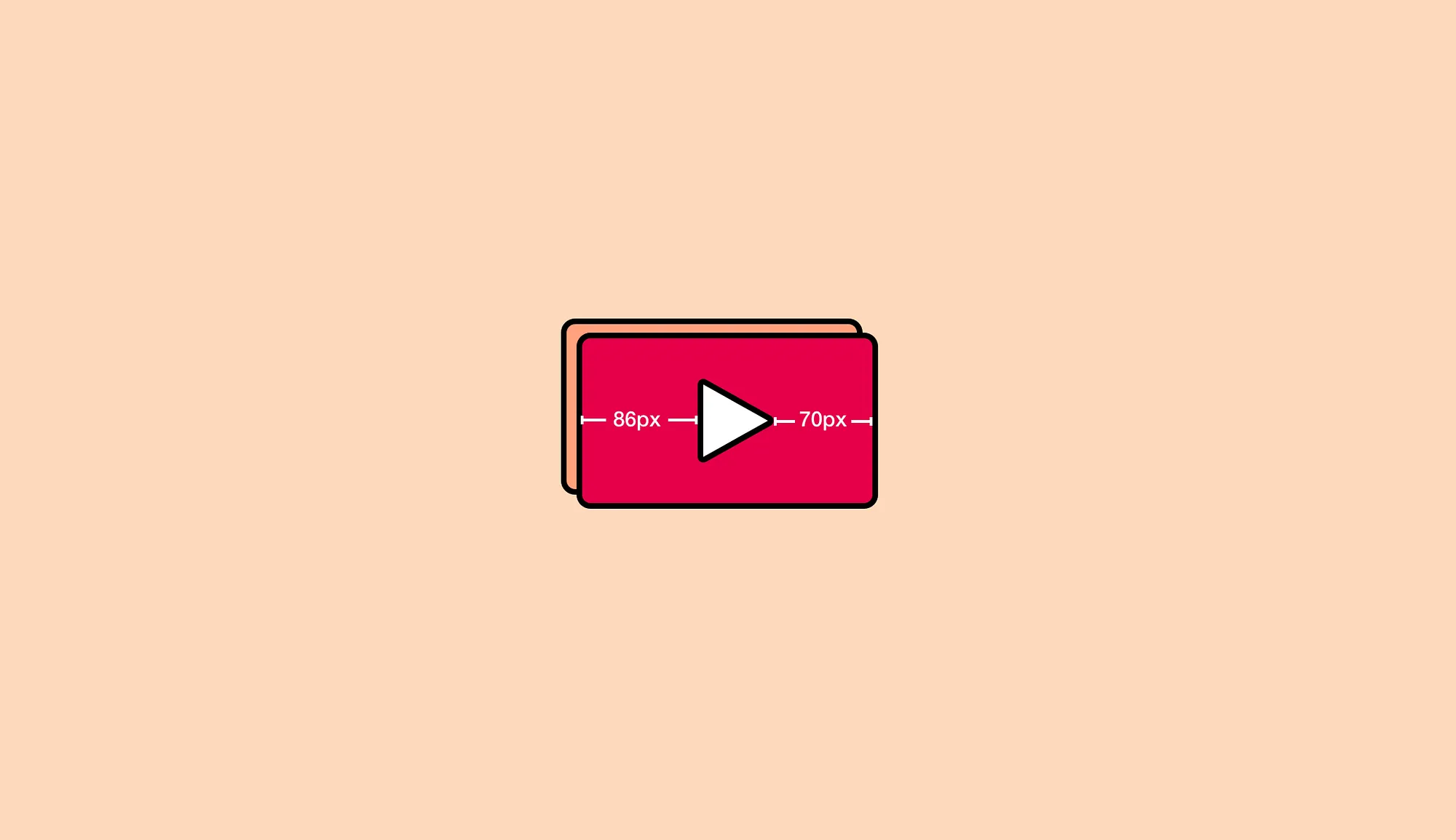
Here’s another image from the first article:
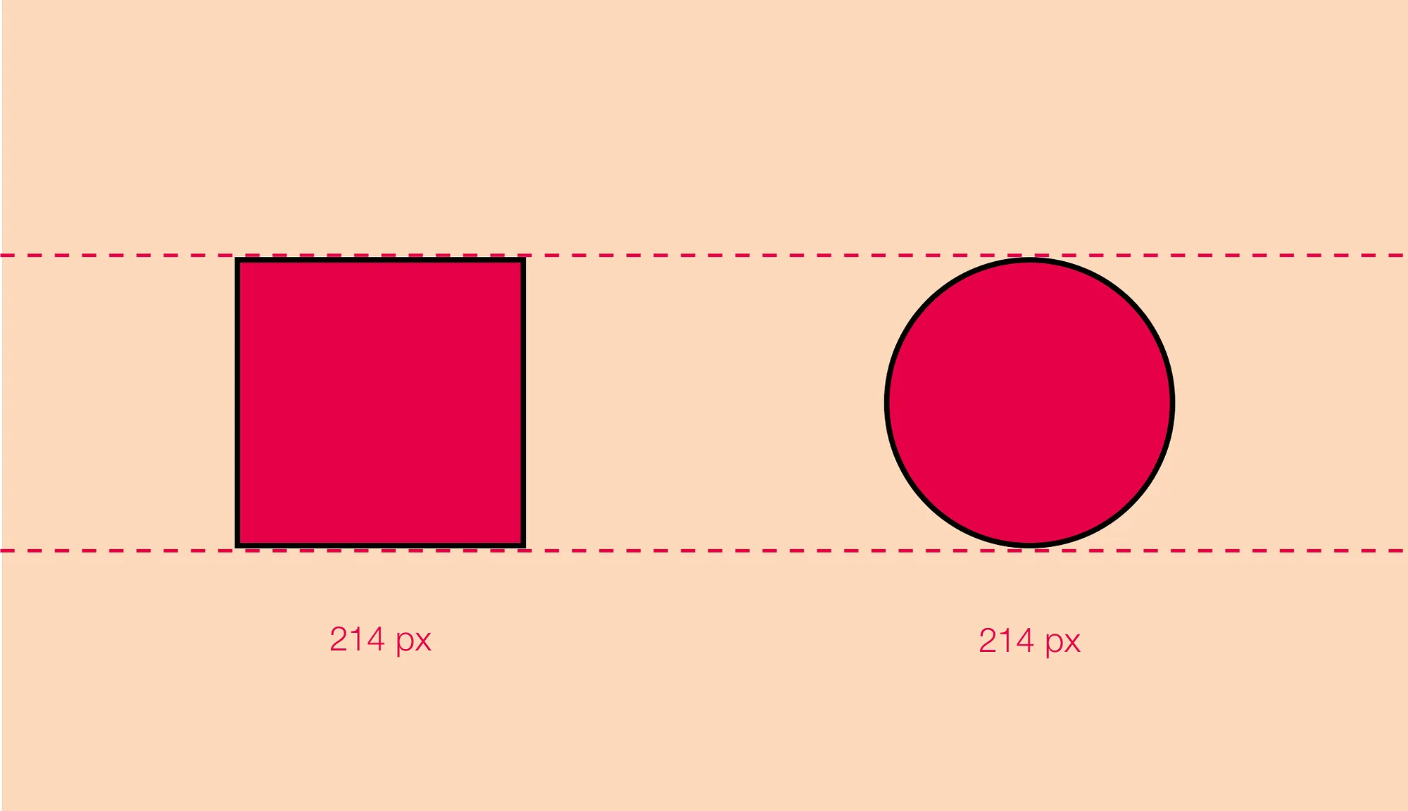
The post explains that we need to increase the size of the circle because the square looks larger. However, the post doesn’t explain how much you are meant to increase it by. Is it until it LooksGood™? Even the post they’ve linked to doesn’t explain how to do it. The best suggestion is to blur the icon but that seems even less precise. So what’s the answer?
The visual weight looks different between the square and circle of the same height because they are different. What we actually want is shapes of a similar area. Here’s an image from another post that discusses optical alignment:
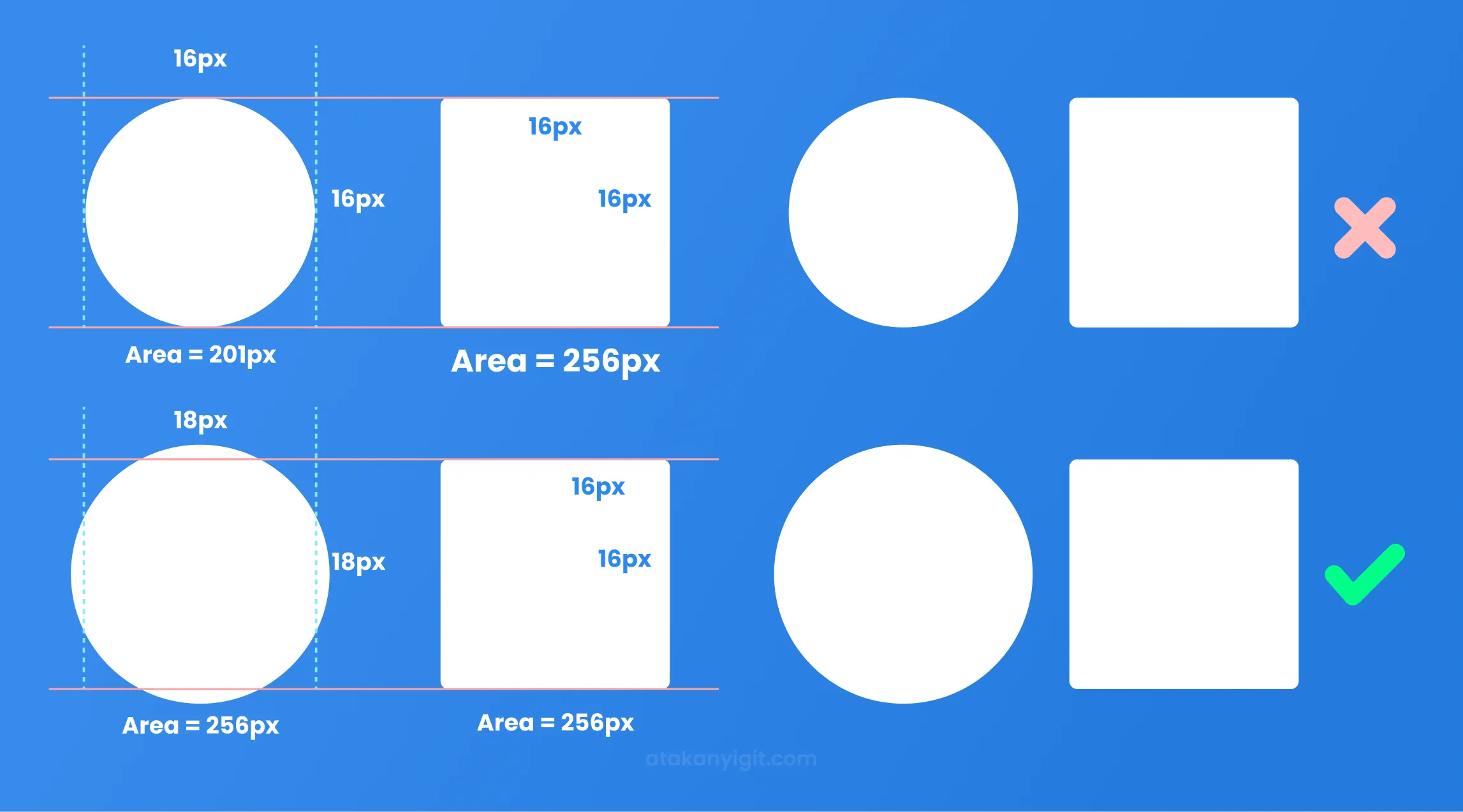
As you can see, we now have a repeatable process to help understand why the circle is larger. In fact, we have created tools to help us with this:
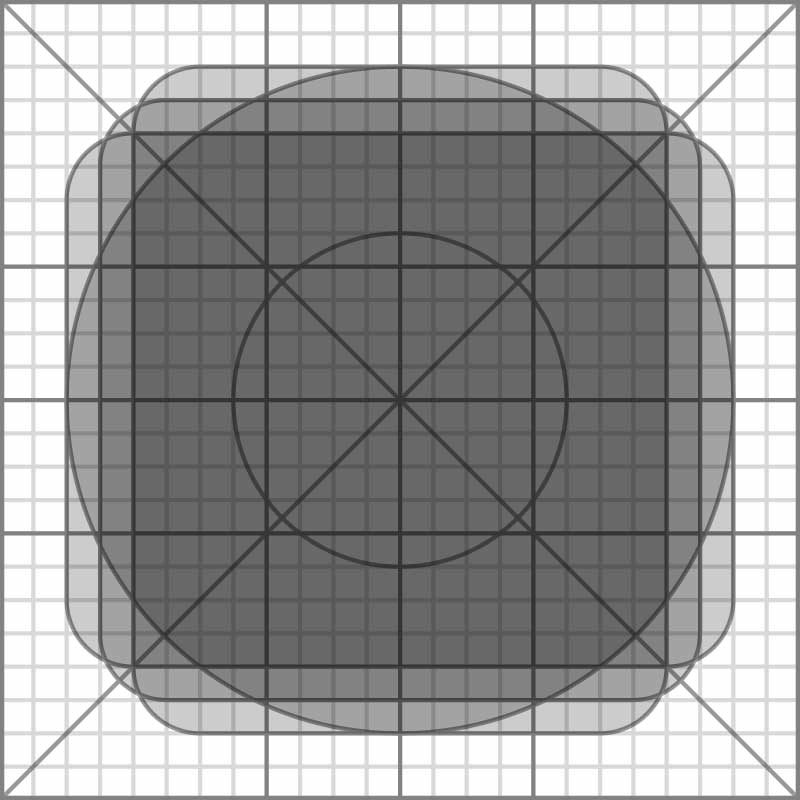
This is the keyline grid provided from Google’s Material Design documentation. That’s right, the guy who wrote Gridless Design is recommending a grid as a tool. This is used to help designers draw icons with a consistent size and alignment. There’s more detail about how to use this grid at the documentation page.
But let’s look deeper into this grid with our new found knowledge. Let’s measure the area of the main shapes provided by the grid. If we count the number of grid squares we should get an approximation for the area of the circle found within the keylines using the following formula for a circle:
So 314 grid units is our approximation for the area of the circle. Now let’s check the area of the square found within the keylines:
Is this the best we can do for the grid? Let’s check where the width is a smaller or larger grid:
We can see that this is the closest we can get to have the circle and square match in area. Only off by about 10 grid units. With a higher fidelity grid, we could get even more precise. But the bottom line here is that we’re trying to make shapes of equal area when we are “optically” sizing these elements. That’s why this grid is recommended and why it works.
Math isn’t being thrown out the window in favor of design, most people are using the wrong math.
Circling back
Returning to the image that started it all. I’m not a typographer, so I’m under qualified to speak about how to adjust the G in the logo so it LooksGood™. And in reply to the post, I said that right now I’d chalk it up to pure brand personality. I have confidence there are qualities of typographic glyphs that follow some of the thinking I’ve demonstrated here but I don’t know precisely how they relate so I won’t comment on it now.
However, that bar in the search field. I can’t agree with that. And it’s true I’ve never noticed it before, and often times when I’m just navigating around a user-interface I don’t notice things that are off by a few pixels. This isn’t because I’m not a designer (though I do consider myself one), this is because I’m not spending the amount of time staring at a user interface decision to care about what went into it. Only unless it looks out of place while I’m using it does it catch my eye and these few pixels weren’t enough to stop me.
This describes one of the largest biases in our work, staring at it for too long. In the best case scenario, the user doesn’t remember anything about your work. They got the task done, and they moved on with life. The amount of time some of industry spends staring at the details can be wasteful in the grand opera of user experience. So if the space between top and bottom of this bar was deliberate, I’m not confident many people would have noticed unless you had the time to stare at it.
But since we’re looking at it, let’s talk about it. Or rather, let’s talk about another search bar that the original author shared in the comments: Atlassian’s search bar.
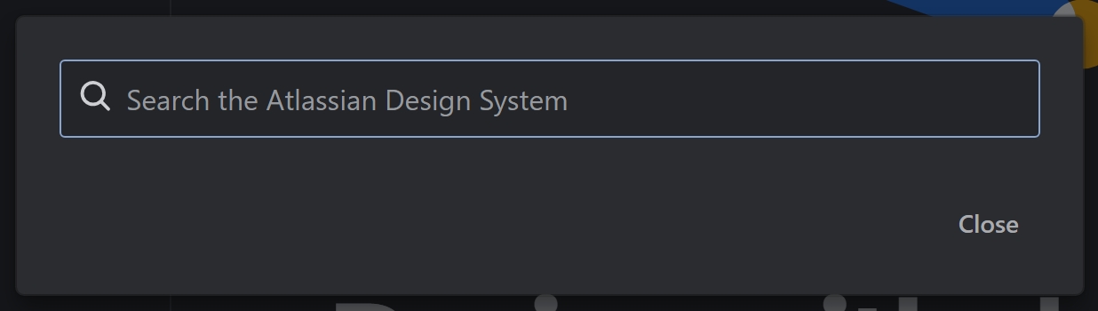
The original poster argued that if Atlassian is also misaligning their icons that it all must be some conspiricy against proper alignment techniques. That response is an exaggeration instead of taking a moment to think why they could have done this. Let’s look at a few things by making some lines and pixel measurements.
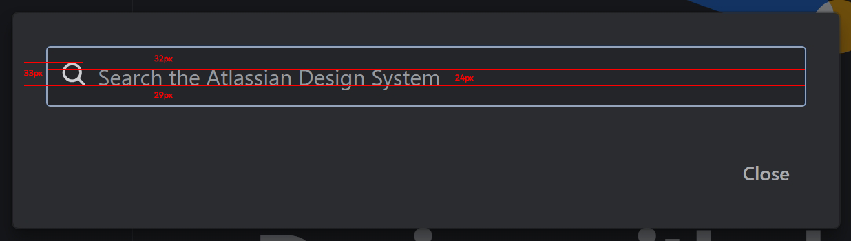
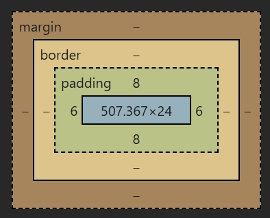
One of the first things we can see is that there is alignment. The team may have chose to align the icon to the baseline of the text. The next thing we can see is that it would seem that the text isn’t truly centered within the frame. Is that intentional? No, at least not in the way the web designers were expecting it to happen. We can see what’s happening when we inspect the box in devtools.
Measuring by eye in my editor isn’t getting me perfect results! What gives? This is most likely due to how the font sits within the line-height box. There’s a great post about this if you want to dive into it. But what’s most likely happening is that the font doesn’t sit in the vertical center of the 24px line height box, which causes the space on top to be larger than the bottom. If this was a custom font provided by Atlassian, they would be in control of how the font sits in this box. However, they’ve chosen to use ui-sans-serif which will use the current font of the operating system the user is using. So they have no real control about which font that is or how that font sits in the line height box.
Back to the icon, if we continue inspecting, we’ll find that the icon is not found within a perfect square even though the icon width and height are declared identically.
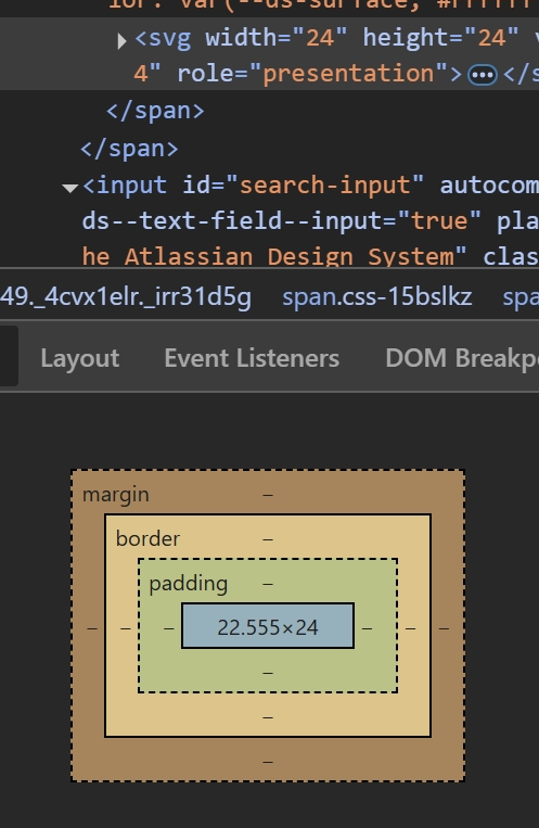
How could this be intentional if the size is declared as 24 but not rendering as 24? In my opinion, this wasn’t intentional. The fact is that the amount of difference between the rendering and the intented size is so slight that it wouldn’t matter to look into it further. The icon LooksGood™ so we ship it. In this case, it’s doing the job so it’s fine to move on to something else.
However, if they really wanted to make the icon a 24x24 square, it’s only a matter of adding flex-shrink: 0 to the direct child of the flex container holding the icon and the input elements. This is a common rule I tend to put on my icon elements when they appear in flex containers because they can be easily squished. The flex-shrink: 0 tells the <svg/> that it shouldn’t be affected by siblings that are growing to take up space.
As for centering to the baseline, this could be intentional or it could just be an artifact of the elements used to compose this component. The element being used to hold the icon is a <span/> element which is classified as an inline element so it behaves like text. This means its size can be affected by line height among other properties. If we were to change this to display: flex (or even inline-flex), then the box doesn’t behave like an inline element anymore because the flex algorithm takes precedence. Making that change, along with the earlier flex-shrink: 0 change on this element inside the current flex container set with align-items: center would vertically align the icon and text as best as the CSS algorithm can do.
Whether or not these decisions were deliberate or oversights, I can’t tell from the outside. Only the author of the component could disclose that. We’d always like to think these large companies are making choices intentionally but in reality there’s often so much going on with not enough resources that it’s often a matter of being good enough. I’ve found other areas where improvements could be made but you have to weigh the effort over the impact. Does it really matter if the icon isn’t perfectly centered? Will the user care or will it stop them from proceeding?
Space bar
So when it comes to the bar in the original image, my best guess there isn’t that it was planned to line up with the icons outside of the search bar, since that is against Gestalt’s law of proximity. It’s more likely that it was an unnoticed few pixels in an otherwise good enough to ship component. If they actually do line up with the icons outside, I think that’s more serendipitous than meticulous. Die-hard designers can justify this all they want with “known design principles” but I find understanding why to be more powerful and harder to refute. Since no one but the original implementer could tell us, all folks tend to do is assume that it was intentional because this is a big company. As we now know this doesn’t need to be the only story.
The point here is that you shouldn’t just take what other folks have said as gospel, especially in the case of design at large organizations. Challenging the norms is how we get innovation as long as we explain the reasoning behind what we do. When you explain those repeatable reasons, you are more likely to gain agreement than through trying to convey your feelings. The difficulty here is that we cannot itemize every single decision we make in design, especially in the production environments of building products. In many cases, we just need to get the proof of concept out the door and good enough for the next round of funding. That’s why we hear so many cases of poor accessibility, performance, and personalization in the majority of experiences. We have no time to explain why, it needs to be out yesterday. We have no time to fix it when we find out it could be improved, we have another priority. That gets repeated by other smaller organizations hoping that the big dogs did it well and that’s how we get bad patterns, like floating labels.
And when a design systems architect tells you they have experience in this topic, blocking them from the conversation really emphasizes how much your argument LooksGood™. 😏