
Ever since the introduction of viewport units, people have been trying to make the font size adjust to size of the device. Before the min(), max(), and clamp() CSS functions, this was typically done with some breakpoint that says to stop using the viewport and end at some fixed number. Otherwise the font size might become to large or small as the device size changed. It’s a lot easier with something like clamp() now because you can define all of those things in a single assignment.
An accessibility consideration
You should know that there’s a gotcha in just putting a single viewport unit in these functions which is described in detail in this article at Smashing Magazine. The tl;dr here is that zoom level and viewport units can essentially cancel each other out. So a person expecting the font size to change will instead get a font size that doesn’t respect their settings. The adjustment to make is to include some fixed unit with the viewport, like this:
h1 {
  font-size: clamp(16px, 15px + 0.2vw, 18px);
}
The fixed value helps ground the change so the zoom can work correctly. You can either figure out what the values are from the math outlined in the article, or you can eyeball it by playing around with the values.
Levels of importance
Recently, Kevin Powell released a video about fluid type which introduces the possibility of using container queries to affect the font size. He goes into a few of the considerations you need to keep in mind when using the approach, and does get into some lesser known features of how CSS works. I recommend watching the video as I did learn something from it. But I also want to raise something about it also.
When I initially heard of container queries, I also was thinking about using them for typography. After all, there’s certain layout patterns where the heading that would normally fit nicely across the entire page won’t fit in a smaller panel. It makes sense to reduce the size of the text so it can fit in the container. However, I’ve since walked this feeling back and now avoid container queries when curating typography. The reason is very simple, it makes hierarchy of information hard to follow.
To demonstrate, here’s what Kevin started with in his video:
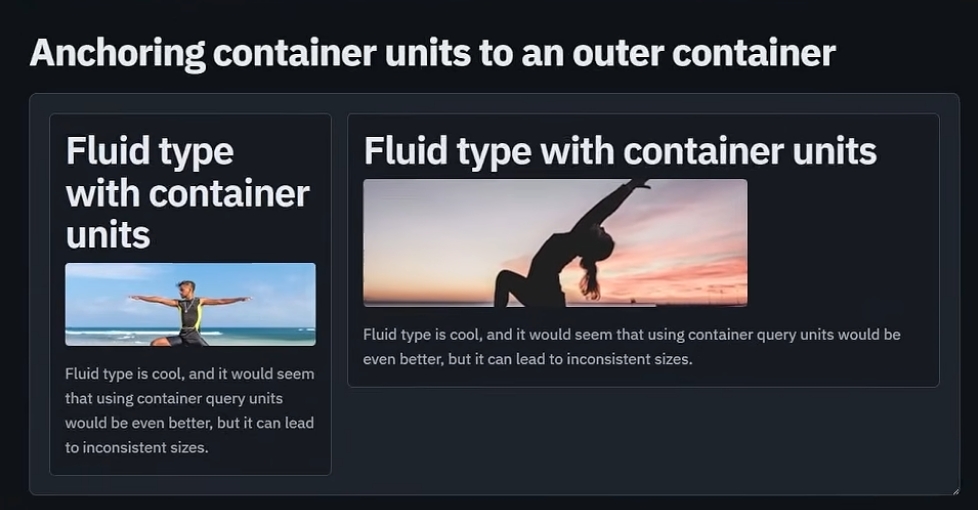
In the image, there’s two cards, one of them is shorter in width than the other which cause the heading of that one to be wrapped onto several lines. The other card is allowed to stretch and thereby allowing the heading to not need wrapping. Importantly, both headings appear to be the same size. This says that the content of both cards is meant to be treated in equal priority.
Admittedly, I’m identifying this from a content hierarchy perspective. I would also say that the size of the card also contributes to the perception of what is more important and a larger card could be considered more important at first glance. Though comparing the heading size between these cards in the next step, we could determine they are meant to display a similar level of importance.
This is what was shown at the end of his video:
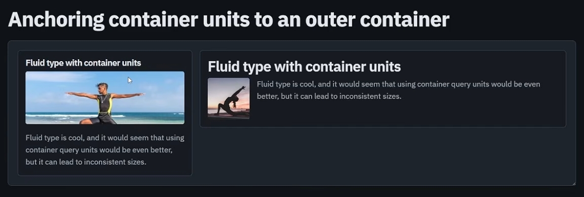
Now to be fair, the examples are contrived and most likely exaggerated for the purposes of teaching. However it does a good job illustrating the underlying consideration. If the headings are meant to convey that the content is of equal importance, then the font size being affected by the container size is causing them to look like they aren’t equal. This might be unexpected. If you have a container query font size for all h2 elements, then all h2 elements might not look the same. In fact, they could look like smaller headings even if those kinds of headings don’t exist. Imagine, in the images above, that you didn’t use headings below h3. It’s very possible that the container a heading is placed in could look like a smaller one just because of where it is.
The real problem
If you know my work, you should be familiar with Mise en Mode. In this work I speak about values that change just based on where something is placed. You might think this is conflicting with the warning that I am raising above. About how the font size could change just because of the container it is in. There’s an important distinction between them that needs to be said. The real reason why I don’t recommend using container queries for font size is because the width of that container could be anything. There’s no way of keeping the font size consistent, especially in comparison to other similar compositions. The content itself could contribute to the size of the heading!
In Mise en Mode, I suggest that the heading size could change with a concept of density. The more dense the content is, the smaller the sizes of things within the scope. This could make the h2 elements smaller in relation to other h2 elements outside of this area but that’s because everything in that area could scale down proportionally. Areas that have the same density would otherwise have identical sizes for things.
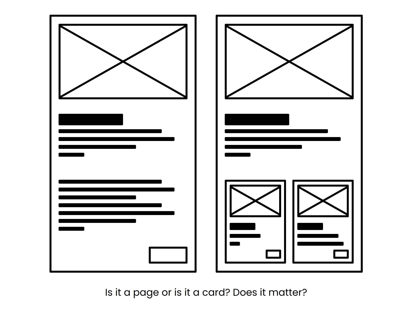
But the important thing is you are in control of what the size of the heading will be not the container it’s placed in. You choose the value specifically and choose when it is applied deliberately.
So if you want to have fluid typography, I recommend sticking with viewport units. This keeps the changes to the elements uniform across similar compositions. This includes when using it with a Mise en Mode approach. In fact, I have a very specific setup using viewport units for headings and I’m waiting for the ability to divide by a unit number in CSS to make it easier to use. C’mon Firefox!