
One of the most confusing but ubiquitous patterns in design is “small text with a background color that may or may not be interactive”. To some that sounds like a button with an identity crisis but to others they might recognize this as a few names: chip, badge, pill, tag, or even lozenge. It’s bad enough that the definition of these things is contested, but what is worse is because they are all generally so visually similar, it makes it hard for the users to know what they are meant to do.
Let’s play a game
As a little exercise, all of these are from the same design system. Try to guess what the name of each of them is:
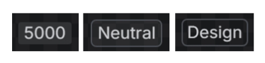
Before I reveal the answers, just think about my earlier definition of these things. They all match the description. Remember that users aren’t discerning the small idiosyncrasies between them, they are most likely lumping all of these into the same category “small text with background color”.
Ok, next exercise. Here’s the definition of each of these components:
- A visual indicator used to communicate status.
- A compact label used to classify, organize, and categorize information.
- Used to display numeric status data.
The definitions here might give you a hint about which of these components they are assigned but only because of the content found in the examples. Again, think about what is more likely happening. A designer is probably thinking I need “small text with background color” and every one of these satisfies that criteria. How often do we find designers justifying which one of these things they are meant to use? I’d argue it’s more common to have a preconceived notion of the visual design without thinking why they are choosing that approach. It’s usually gets reduced to “I’ve seen it before” or “this other big company does it” without much of a conversation to justify the decision. We’re encoding a few whys as definitions to justify different components, but in the end we often miss how that why is helping our designers or our users.
The answers are below:
- Badge is a visual indicator for numeric values such as tallies and scores.
- Lozenge is a visual indicator used to highlight an item’s status for quick recognition.
- Tag is a compact label used to classify, organize, and categorize information.
Filters and categorization
The following examples are from Uxcel, specifically their page on “UI Chips”. Take a close look and try to figure out the difference:
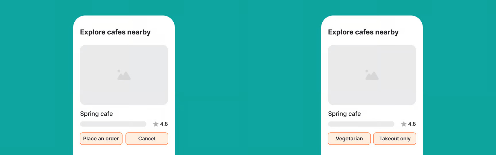
These are the first images of their explainer where one of these is described as a “do” and the other as a “don’t”. At a glance, it’s very hard to tell which the do and don’t is. Here’s the text from their explainer:
You might wonder how chips differ from buttons. They can look similar, but they work differently. Chips, especially when used as filters, help users narrow down or adjust what they see without leaving the current view…
Buttons, on the other hand, are for clear, single-purpose actions like “Save,” “Submit,” or “Cancel.” They’re used when the user needs to make a decision or move to the next step.
But isn’t filtering an action? To filter is a verb, therefore an action. And each of these chips is filtering meant for a single-purpose, to filter the entities represented by the label. Buttons aren’t meant to leave the current view either, they are meant to execute an action.
It’s very easy to pick the definition apart to show that there’s not much difference happening here, not just visually but also behavior. The only difference that I could glean from these is that the labels on the chips are nouns, representing the entities that will be affected once you tap the button. Meanwhile, the buttons have verbs telling you what will happen. For buttons, this is good practice. The label is describing an action, and a user reading that label can assume interacting with this element will perform the action on the label.
But the chips example is very ambiguous. Again, users don’t care how you classify this thing as a button or a chip. They are trying to figure out how it is going to help them. So, they’ll look at the chips example and potentially wonder what the “Vegetarian Button” does. Some folks will tap it, some won’t because it’s not clear. Now, let’s see an alternative:
I know what you’re going say: “Donnie, that’s too much text!” In comparison to the original, absolutely. However, you can’t argue that this approach is more clear about how I’m meant to interact with this UI, and what the result will be. If the amount of text on each label is truly bothering, consider a hybrid approach:
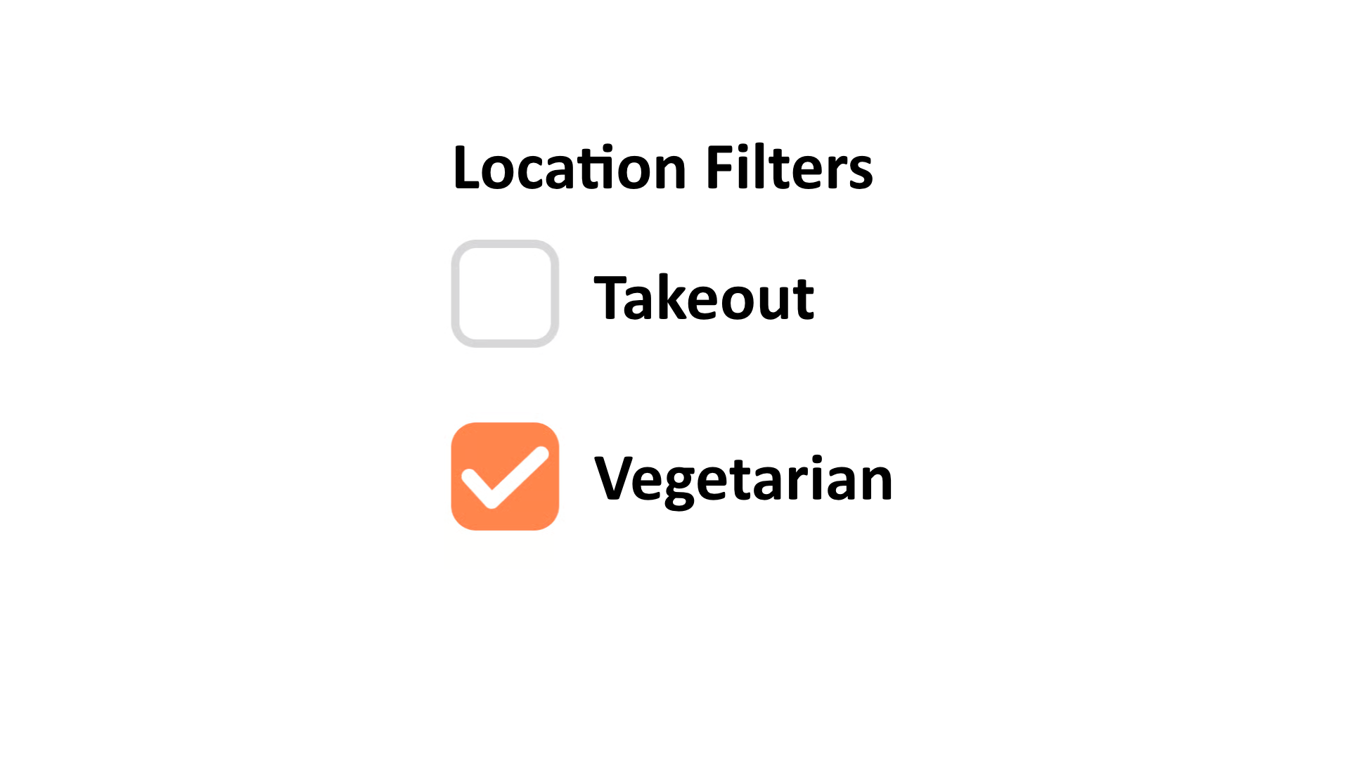
But hold on, are those chips in the original comparison image actually filters? Take another look, because these things could simply be describing the attributes of the location, and not actually do anything if you tap them. If that’s the case, then the image barely matches their description of a chip! If these chips aren’t filters, then it’s just a stylized list.
Schrödinger’s button
This is ultimately the largest problem with this pattern. It is very often a guessing game to figure out if this thing is interactive. Take a look at this example and ask yourself, can I click the element that says “Pro”?
The answer is 🤷, it’s Schrödinger’s button. You only know if you can interact with it until you do. Until then you are left guessing about if you can. You might think, what is the harm of tapping the button to find out? You might be surprised in research that shows a type of koumpounophobia; a fear of buttons:
…older adults had many negative emotional user experiences, including fear of pressing buttons and embarrassment of incompetence.
So, it is possible that your user won’t even try and never discover something that you felt was useful because they don’t know what “Pro” does. Does it work like a checkbox and revoke the “Pro” status for this person? Does it tell me what a “Pro” is? Does it tell me why this person is a “Pro”? The fact is, this element is probably not interactive. So, don’t make it look interactive.

Or if it is interactive, tell me what it will do. Make it a verb. Be deliberate in this decision. And of course, make it look like a proper button.
You should also ask, does this need to be in the interface at all? Is it important that a person know this is a pro user? Ask yourself what is that importance. It’s true that social comparison is a motivating factor and seeing someone with a physical conference badge walking around your city can have a fleeting thought “I wonder what they are showing at that conference?” So, having a digital badge on your profile, like a verified badge has a similar effect. If that’s the case, consider using other treatments that show status that are clearly not interactive, such as typographic hierarchy to show importance.

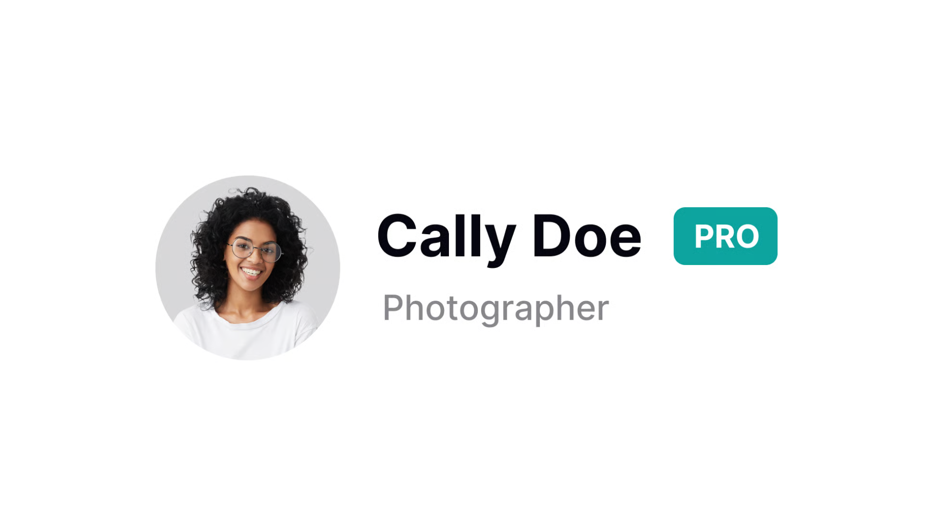
In this example Cally is both a “Pro Member” and a “Photographer”. We display a slight difference between the status that was given to user from the status that was chosen by the user. If icons are well understood within the product’s ecosystem, you can consider adding an icon to further highlight the status.
Tag inputs
Sometimes, this element is used in combination with a text field. The tag input is a pattern where you have an input field that allows you to enter text, and when you hit a special key (like a comma), it creates an entity with the text you entered. The benefit of this pattern is that a user can create several entities on the fly. Otherwise, the user would need to create an entity, give it a label, and save it for each piece of information they want to enter. With a tag input, they can just keep entering text and creating new entities without having to go through the process of creating and saving each one individually.
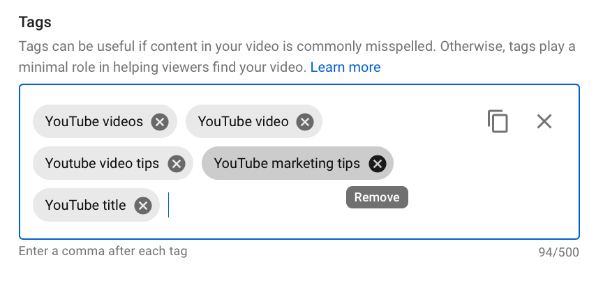
The challenge with this pattern is accessibility. When keyboard navigating to each chip, how does it focus? At first you’d expect to focus the entire chip, but then the next tabbable element would be the “x” button inside the chip. This means that technically we have an interactive element inside of another interactive element, which is an accessibility violation. This also requires someone to tab twice to move to the next tag.
The more appropriate approach is to make the tag a non-interactive element, and only make the “x” button interactive. This way, when you tab to the next tag, it will focus the “x” button, and you can press it to delete the tag if you want. This also means that you can easily move to the next tag without having to tab twice. Think about it, why would you want a person to focus a newly created tag if the only thing they can do with it is delete it? It doesn’t make sense to have a person focus something that they can’t interact with, and then require them to tab again to interact with it. It’s much more efficient to just focus the interactive element directly.
Another note about accessibility for this pattern is that when you create a new tag, you should announce it to screen readers. This can be done using an ARIA live region, which will allow screen readers to announce the new tag as soon as it’s created. This way, users who rely on screen readers will be aware of the new tag and can interact with it if they choose to.
<div aria-live="polite" aria-atomic="true" class="sr-only" id="announcer"></div>And then when a new tag is created, you can update the content of the live region:
announcer.textContent = `Tag added: ${value}. Press Backspace to remove.`;While it is common to visually put instructions on how to use the tag input below the input field, it would be better to show this information above the field. This goes for any input field, but especially for fields that have uncommon behavior, such as eating commas to create tags. Imagine how confusing it would be to have an empty canvas and not know what you’re supposed to be doing with it until later. Having instructions upfront prepare the user for what is about to come.
Don’t forget that users can also dictate in accessible technologies, and depending on the user’s settings, commas may be inserted automatically instead of deliberately. It is possible that for some users, speaking the word comma will enter the literal word “comma” instead of the punctuation. This is something to consider when designing the interaction for this pattern, as it may not be intuitive for all users. There’s also no reliable way to know if the user is dictating, as this is often supplied by the operating system. This also doesn’t account for an Input Method Editor (IME) for non-Latin languages, which may have their own unique behaviors when it comes to punctuation and special characters. It’s important to consider these edge cases when designing the interaction for a tag input, and to provide clear instructions for all users on how to use the feature effectively.
Unless, you simplify by using a pattern that nearly every developer has built as their first project:
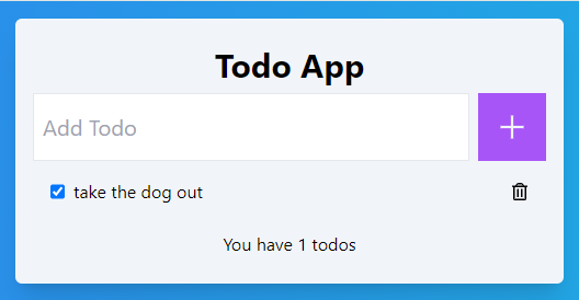
- No delimiter parsing
- No dependence on comma
- No IME conflicts
- No dictation ambiguity
This is a much more straightforward approach, and it still allows users to create multiple tags on the fly without having to go through the process of creating and saving each one individually. It’s also more accessible for users who may have difficulty with the original pattern, as it doesn’t rely on specific key presses or punctuation to create new tags. Overall, it’s a simpler and more inclusive design choice for a tag input feature.
A hard pill
While this post seems to be stripping all of the fun out of user interface design, the intention is to encourage designers to be more deliberate in their choices. To stop and think about how people outside of their tech circle might use this product. If you are going to use a pattern that has ambiguity, make sure you are doing it for a good reason. If you are using “small text with a background color that may or may not be interactive” just because it looks nice, then you might be alienating users; users who want to pay for your product. It’s important to remember that design is not just about aesthetics, but also about usability and accessibility. By being more intentional in our design choices, we can create interfaces that are not only visually appealing but also easy to use and understand for all users.