Material Design 3 (Material You) was officially unveiled at Google I/O in May of 2021. At the time the new M3 site was still in the works with only a few analogs to the earlier Material Design site. I didn’t think much of this at the time, especially since 2021 was a busy year for me personally. But now, Material has a “new” launch called Expressive with an article explaining how we got here. The article triggers me for a few reasons:
Boredom
One of the first paragraphs in the article has the following quote:
Back in 2022, our research intern was studying user sentiment toward Material Design in Google apps. After mentioning her initial findings to colleagues in a Munich beer hall, she sparked a team-wide design debate: Why did all these apps look so similar? So boring? Wasn’t there room to dial up the feeling?
One interpretation of this story is that you too can make a difference in a large organization with a small idea. Sounds very inspiring. However, when I read this, it looks like a group of designers were bored. There’s no user need spearheading the work. And this is something we see all the time. Some new designer comes in, looks at the current body of work for something they can own, and turns it into some project for a promotion. This occurs even if everything is working fine.
Don’t get me wrong, there’s always things that can be improved, but it’s rarely the way that things look. It’s more often the way things work that need improvement. Unfortunately, it’s easier to put a new paint job on some walls than it is to teardown and rebuild parts of the house. A new coat of paint can really help make the room look new, but someone should really consider moving the toilet out of the kitchen.
LooksGood™
Later in the article we get some “data”:
These factors can be quantified in users’ responses to new M3 Expressive designs. We found a 32% increase in subculture perception, which indicates that expressive design makes a brand feel more relevant and “in-the-know.” We also saw a 34% boost in modernity, making a brand feel fresh and forward-thinking. On top of that, there was a 30% jump in rebelliousness, suggesting that expressive design positions a brand as bold, innovative, and willing to break from convention.
These numbers are points describing the Aesthetic-Usability Effect. Imagine conducting a survey and asking people about their feelings toward cotton candy versus a shovel. You’re going to get an overwhelming amount of positive responses for things that look fun and inviting over things that are designed to solve a user problem. If you then ask about the feelings between a pastel shovel and a brown shovel, you’ll probably get more people liking the pastel one because it looks unique and fun.
The bottom line here is that we need things to be usable first. We shouldn’t be triggering a redesign unless we need a hole and all we have is cotton candy.
False positives
The next is an image from the article:
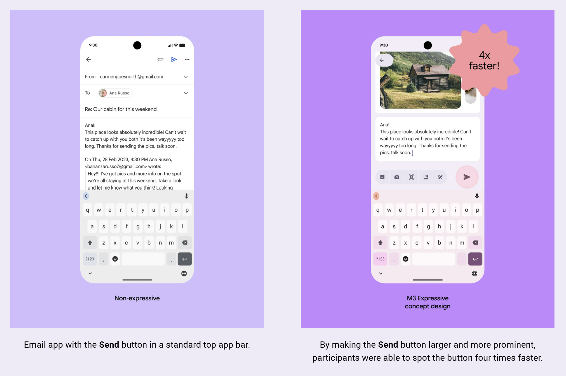
The article claims that the participants were able to find the send button 4 times faster with the Expressive redesign specifically because of the following:
By making the Send button larger and more prominent…
However, I’d argue that the size and cosmetic treatment didn’t have the largest impact here. It certainly contributes, but the placement change is more of a signficant factor. To demonstrate, consider if we were to imagine eye-tracking on writing an email. Your eyes should be following the words as you type, left-to-right moving downward. This means when you are finished, your eyes will be lower on the screen.
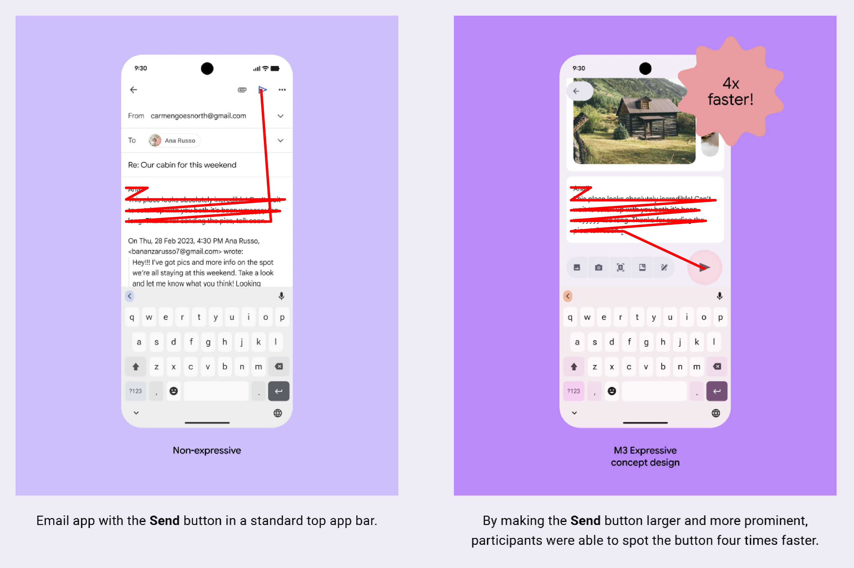
This also means that the send button in the original application is in a suboptimal spot at the top-right corner. This isn’t just due to how we read, but items on the top edge are often overlooked in user interfaces as they are normally reserved for more generic items like user accounts or settings. The main action should be more prominently featured within the context of the user task.
This is the difficulty with testing too many changes at once. You may wind up with a more usable solution but not know what of the changes was the definitive improvement. Changing the size, color, and placement of the button all at once can make it seem like the cosmetic changes were the qualities that provided the impact and falsy drive more resources into something that didn’t truly need it. Imagine painting your bedroom and realizing you have a lot of left over paint. So you decide to repaint all of the walls. They didn’t need to be repainted, you just did it because you were already motivated for that task. Meanwhile, the toilet is still in the kitchen.
Unfamiliarity
One final quote at the bottom of the article:
It is also worth noting that while expressive design improved preference and usability, it was impacted by users’ lack of familiarity. This is a challenge that designers will have to navigate, but we expect to see familiarity increase as more and more apps adopt this new style in the coming months.
This paragraph is justifying what happened during the hamburger menu explosion of 2016 and beyond. There’s plenty of articles showing both sides of the story across the internet ending up in a firm It Depends™ from the community. When there’s so much debate, it’s easy to get lost in the opinions. The reality is that you want familiarity. This is Jakob’s Law. The more you make things unique and unfamiliar, the harder it will be for people to use.
Take the new expressive email interface from before. I can’t tell you what all the other icon buttons next to the send button do. Why is it “image” and then “camera”? Can’t I see my images from the camera? Maybe the next one is a document scanner? Does the scanner write the document into my email or does it just attach like the paperclip used to do? I have no clue what the fourth icon is supposed to be. That last icon looks like a pen so maybe I can draw something in the email? All mostly unclear and unfamiliar.
Take caution
The main point I’m making here is we’re seeing more designers going for low-hanging fruit of cosmetic changes instead of truly improving our experiences. I’m afraid that design teams are going to look at this “research” to justify their own exploration into expressiveness while neglecting better experiences for users. A technique like Mise en Mode can provide infinite amounts of expression. But at the end of the day, you still haven’t moved that toilet from the kitchen.