
Pixels are an absolute unit, they are expected to represent a fixed size and aren’t affected by outside factors (sort of). While this sounds like a good thing for design because you can be be sure of the dimensions, the reality is that using pixel values in the web hinders user experience. Layouts become unresponsive, translated content becomes unreadable, and accessibility preferences just aren’t considered. In most cases, we want to avoid absolute units and instead use something more flexible that adapts to the needs of the layout.
Relative units are related to something else. An example of a relative unit is percentage and relates to different properties based on where it is used. The rem is a relative unit which roughly represents the size of the letter “M” in the document. If the document font-size changes, all areas where this unit is used will also change. The root font-size can change based on user preference; usually increasing to help folks with vision impairment. There is a not insignificant amount of the population who leverage the ability to change the font-size in user settings so we want to ensure this feature of the web is maintained in our experiences. It’s possible to check this out for yourself.
Hocus pocus
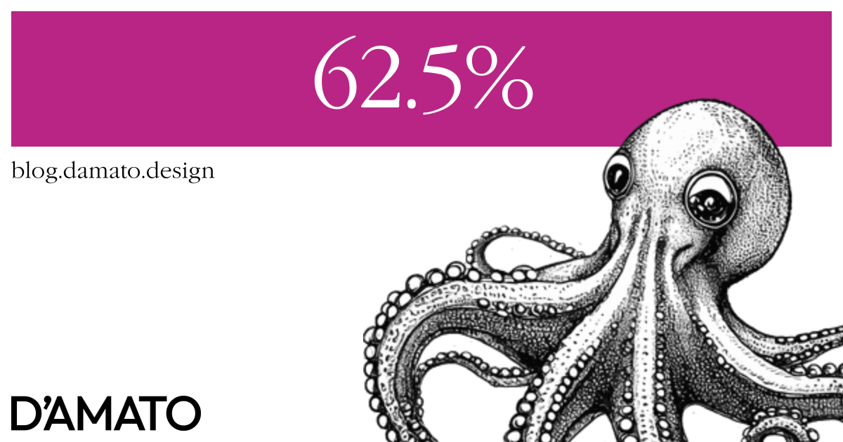
There was a trick by Richard Rutter discovered many years ago which was meant to help folks better understand relative font-size units when coming from pixels. The trick is to set the font-size of the document to 62.5%.
html {
    font-size: 62.5%;
}
The 62.5% looks like what we like to call a magic number; it seems oddly specific. The number is the ratio 10:16 as a percent. The default rem is 16 pixels, so 1/16th of a rem equals one pixel. Multiplying by 10 helps keep the font size somewhat readable (6.25% is too small, 625% too large). Then the final use of this declaration allows for the following:
button {
    padding: .8rem 1.6rem; /* 8px 16px */
}
Here, it is possible to write rem in terms of pixels. This provides the benefits of rem while maintaining a pixel mental model. This post by Aleksandr Hovhannisyan goes into the approach in more detail also mentioning accessibility considerations. Some design systems (eg., Workbench by Gusto) use the approach to make it “easier” to work with rem units. So what is so difficult that warrants this approach?
The fact is that the rem doesn’t exist in design tools, so a translation from pixels to rem must occur for an inclusive web experience. Before this approach, designers and engineers would need to figure out what the final rem number should be based on a formula. Then they would potentially need to repeat that formula every time a new size was needed. In other words, math is hard and to repeat that math is a waste of time. It is “easier” for the translation to occur once globally.
So why would Jeremy Keith say the following about the author and the approach nearly 20 years later?
— Jeremy KeithNot that he—or anyone else—would recommend it these days!
Absolutely arbitrary font-size
Toheeb Ogunbiyi does a deep dive into the 62.5% approach and has some opinions about thinking in pixels:
— Toheeb OgunbiyiThinking in pixels makes it easy to do the following:
- Translate UI Design to code.
- Read the code in the editor.
- Troubleshoot the code in the browser.
This ensures a better development experience. In addition, the mental model is maintained across the team.
What if I said that mental model being maintained is baseless artifact of legacy computer graphic design? 😱
When you select a pixel font-size, what does it mean? More specifically, what is the difference between Courier and Verdana at 16px? In practice it’s meant to represent the em square. In the harsh reality, it doesn’t really mean anything. That means we could use 16 pigs, or 1 barn, maybe 8 tulips to talk about font-size if design tools were prepared to use these units. It actually doesn’t matter as long as the visual result is expected. That’s what we are really doing when curating font-size. We are tweaking some input and assessing the visual output. When we get something that Looks Good™, we record what the tool says in the input to repeat the visual style in digital media elsewhere.
So why do we need to use the pixel value so much? It’s because that’s what design tools have decided to use to define the font-size among other computer graphic properties. If the design tool was to include the rem as an option, we would have a 1:1 relationship between the design expectation and the engineering execution and no need to require this translation at all! You could speak in terms of rem right in the tool; no math required. The design tools are the problem and this “solution” is a community hack for a missing feature.
Subverting expectations
When the font-size value is redefined at the html element, the representation of the rem is changed for the entire document. This means that third-party elements could look incorrect; designed with the rem to expect the browser 16px default. This even includes usage of rem in the Shadow DOM. Josh W. Comeau calls this out:
— Josh W. ComeauThere’s a baseline assumption on the web that
1remwill produce readable text. I don’t wanna mess with that assumption.
He also mentions that adoption is difficult because it would need to be done all at once. There’s no possibility of incremental enhancement. This also means that deprecating the approach is also troublesome. So you need to be very sure in this decision, more than most others.
Back to base
So instead of thinking in terms of pixels for font size, think in terms of a base (or root) size. What is the font size that is most used in the document? This is most likely your body copy. That should be what the rem represents and exist as the base. Next, any font-size that you want to set past this should be some proportion from the base. How much larger do you want the headline to be from the base? 1.5x larger? 2x larger? 2.5x larger? Guess what, that’s rem! If you’ve set your headline to be 2.5x times larger than the base, that’s 2.5rem.
h1 {
    font-size: 2.5rem; /* 2.5x times larger than your base (root) font-size */
}
If the user zooms the content, that relationship is maintained. This is what Andrés Galante says in his article “Accessible Font Sizing, Explained” at CSS-Tricks:
— Andrés GalanteThink about proportions, not size
While it’s recommended to not update the font-size at html and maintain the default expectations, setting the size here isn’t all bad as long as it’s made accessible. Just recognize that it does affect all use of rem throughout the page where this rule is applied. So reverting this approach later is an exercise of auditing all pages where rem is used and updating the values where appropriate. For large applications and systems, this could be a monumental task. However, if you’ve kept in mind that the rem is relating to the font-size in the usage, it might not be a difficult change. It might even be a feature of the approach. Though, if you use rem as just another unit because someone said it’s better without understanding why, you might end up fighting rem.
Don’t dislike rem because you don’t understand it, dislike pixels because you do.